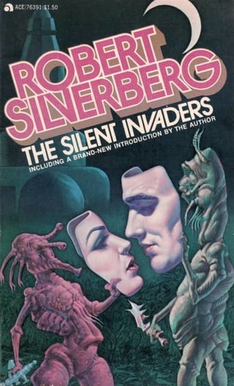
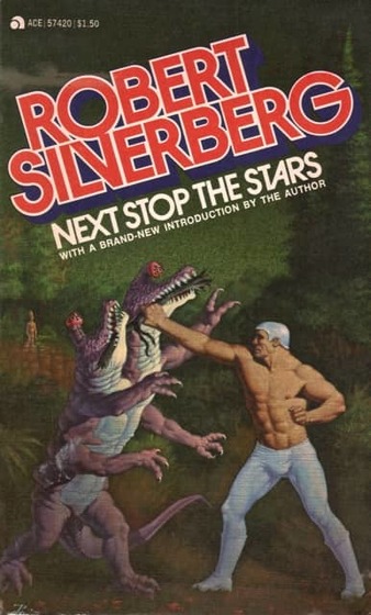
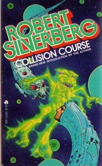
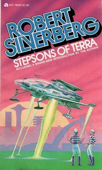
The Ace Robert Silverberg: skewed titles and unclutterd art. The Seed of Earth, The Silent Invaders, Recalled to Life,
Next Stop the Stars, Collision Course and Stepsons of Terra. All from 1977. Covers by Don Punchatz
If you cruised the bookstore and supermarket racks in the 70s and 80s for science fiction paperbacks, Robert Silverberg was everywhere. I mean, everywhere. It wasn’t just that he was enormously productive — that was certainly true. But his books remained in print, or were returned to print, countless times by different publishers.
This was the era when agents would package up backlists by top writers en masse, selling the rights to multiple novels, and publishers would release them virtually simultaneously, usually with the same cover artist. If you had a popular novel — and Silverberg had many — a diligent agent could package and re-package it many times. That’s how Silverberg’s Hawksbill Station was released by Doubleday, The Science Fiction Book Club, Avon, Tandem, Berkley, Star, Warner Books, Tor, and many others between 1968 and 1990, just to pick one example.
The 1977 paperback edition of Robert Silverberg’s Collision Course was one of the first science fiction books I bought (the other was Star Trek 2, by James Blish). Mark Kelly reviewed it for us here last month, calling it “a fascinating, ordinary 1950s science fiction novel.” The mix of far-flung space adventure and galactic intrigue was perfectly pitched for a 13-year old however, and I loved it. Naturally I returned to the bookstore to find more in the same vein, and lo and behold, I did: five more Robert Silverberg novels, cleverly packaged by Ace Books to capitalize on the natural brand loyalty of young SF fans (see above).
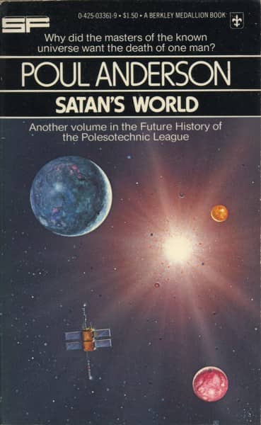
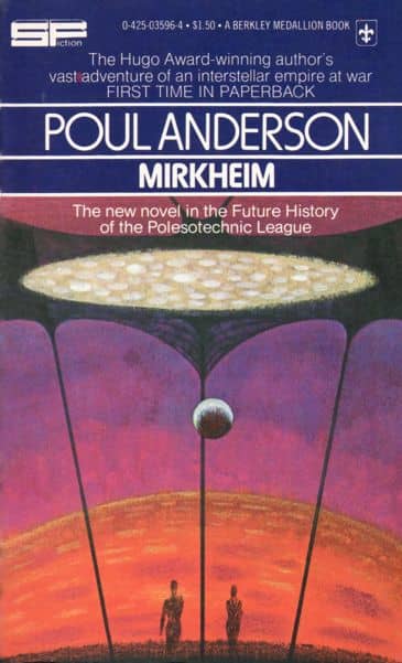
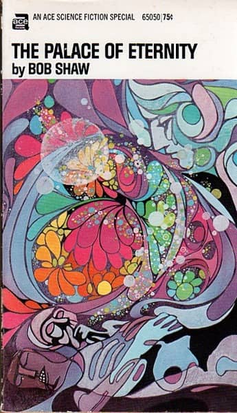
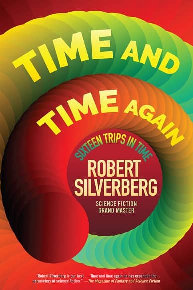
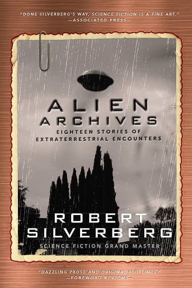
This practice of bundling authors, and creating custom cover designs for each, was by no means unique to science fiction, of course. But if you’re a student of SF art there’s an enormous amount to learn by examining the visual language built up around the most popular SF authors in the 70s and 80s, and the ways editors and Art Directors at the major publishers used that language to draw in readers with familiar images and themes, and simultaneously differentiate themselves from the competition on overcrowded paperback racks.
There are countless examples, of course. But for our purposes, I’m going to single out Robert Silverberg, mostly because he’s the one I think of when I think of author branding. Well, Silverberg and Larry Niven (whom we’ll get to in a minute).
…
Read More Read More
