Vintage Treasures: The Trouble With Tycho by Clifford D. Simak / Bring Back Yesterday by A. Bertram Chandler
 While we’re on the topic of my favorite Ace Doubles (trust me, we were), I should say a thing or two about Clifford D. Simak’s The Trouble With Tycho. Simak is not well remembered today. None of his 28 novels are in print (unless you count low-end Kindle or POD editions from specialty publishers), and he had something of a rep as a SF midlister for much of his career. But he remains one of my all-time favorite SF writers. He won three Hugos: for his 1963 novel Way Station, for the short story “Grotto of the Dancing Deer” (1980), and his 1959 masterpiece “The Big Front Yard,” perhaps the most perfect SF story ever written. He also won a Nebula (for “Grotto”).
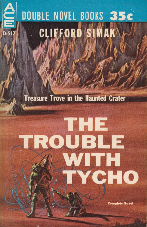
Simak penned many fine SF adventure-mysteries. One of the first I came across was The Trouble With Tycho, the tale of a haunted crater on the moon and the desperate space miners who try to plumb its secrets. It was part of a 1961 Ace Double, with a cover by John Schoenherr and paired with A. Bertram Chandler’s Bring Back Yesterday. Here’s the blurb from the first page.
No Second Chance on the Moon
Prospecting on the Moon was pretty grim and un-rewarding. With no water, no oxygen, and almost no valuable ores, it was one helluva place to try and get rich quick. Only most of the would-be prospectors didn’t find this out until after they’d gotten there.
And Chris Jackson was no exception. He’d gotten the syndicate back home to put up the money for a moon rig and the passage out, and now he had to make good their faith in him. Had to make it on the Moon, even if it meant going into Tycho!
For Tycho was the one place on Luna where there were positive riches to be found — in salvage. The remains of three expeditions that had disappeared in Tycho would be perfectly preserved in that airless atmosphere, and the man who could get to them — and get out again alive — would have his fortune made.


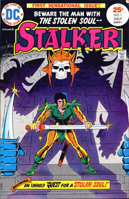 The first stop I made on my shopping expedition last Boxing Day was at my local neighbourhood comics store, which happens to be conveniently located two and a half blocks from my house. There, I found a deal in the back-issue bins: issues 1 to 4 of Stalker, a DC fantasy comic from the 70s. I’d vaguely heard of the title, but knew nothing about it. I thought I remembered hearing that it had good art, which I imagined perhaps meant work by somebody like Nestor Redondo or Ernie Chan. I was way off. In fact, the art was by the remarkable team of Steve Ditko and Wally Wood. As a result, it’s wonderful. And more than that: it’s truly weird fantasy art in every sense.