Browsed by
Category: Art

Revealing the Cover — and an Excerpt — from Robert V. S. Redick’s Sidewinders

Revealing the Cover — and an Excerpt — from Robert V. S. Redick’s Sidewinders

We’re big fans of Robert V. S. Redick here at Black Gate. I’ve lost count of how many of his books our staff has enthusiastically reviewed over the years but… whew, it’s a lot. That’s why we’re so excited at the impending release of Sidewinders, the second volume in The Fire Sacraments series (following Master Assassins, which we covered — you know it! — right here back in 2018).

As if we weren’t excited enough already, Black Gate website editor emeritus C.S.E. Cooney sent us this blurb for the book and I have to tell you, it wound us up pretty good. Have a look.

Sidewinders. I love this book, goddamnit. Robert V. S. Redick gives a fantasy reader everything her fiendish heart craves: plagues, prophets, demonic possessions, a desperate dash through desert dunes, giant spiders, giant cats, creepy children, plenty of vulgarity and sex, and an all-too-brief glimpse of paradise. So sure, if you like that kind of thing, go for it. Read this book. It’s for you. But wait, there’s more. For your not-so-average fantasy reader, your not-so-run-of-the-mill genre-lover, I beg you, look to Sidewinders. For it will give you ambiguity and delicacy. It will not spare you of its irony — and, oh, such irony! Its pages will impart so profound and aching an empathy that it just might leap off the page and follow you into your daily life. There is such courage in Robert V. S. Redick’s Sidewinders — such courage and fury and passion and hope. Truly a breathtaking work.

—C.S.E. Cooney, author of the forthcoming Saint Death’s Daughter, on Sidewinders

Talos Press will be publishing Sidewinders on July 6, 2021. Wunderkind PR were kind enough to send us a high-resolution sneak peek of the cover to share with you — and also a tasty excerpt from Chapter One of the book.

Without further ado — check out the gorgeous cover, featuring artwork by Mack Sztaba!

Read More Read More

My Greatest Antique Fair Find

My Greatest Antique Fair Find

The Master Mind of Mars (A. C. McClurg & Co, 1928).
Cover by J. Allen St. John

Today, I thought I’d share the story of our greatest antique fair find.

Deb and I enjoy going to flea markets and antique shows when the weather is nice. Even if we don’t buy anything, it’s a fun way to spend a couple of hours walking outside while looking at a wide variety of items for sale. We’ve been lucky enough on several occasions to get some good pulp and paperback buys at these shows.

Our greatest find at one of them happened over 20 years ago, when Deb and I went to an antique fair in Chicago.

The Windy City was a hotbed of pulp activity in the first half of the 20th century, with several publishers based there. As a result, many artists and authors also lived there. Among the pulp artists who called Chicago their home were Margaret Brundage, Harold McCauley, Harold DeLay, Hugh Rankin, Jay Jackson, Curtis Senf, Robert Gibson Jones, Joseph Tillotson (also known as Robert Fuqua), Julian Krupa, Malcolm Smith, James Settles and Rod Ruth.

Perhaps the greatest of all of the pulp artists that lived in Chicago was J. Allen St. John. His name immediately brings to mind the stories of Edgar Rice Burroughs, as he illustrated many of Burroughs’ novels of Tarzan, John Carter and others in pulps, slicks and hardcovers. For many years, St. John had his studio in the Tree Studio Building on Ohio Street in downtown Chicago. (Incidentally, my law firm held an event at Tree Studio a few years ago, and it was very cool to be able to walk around it, though we weren’t able to go into St. John’s old studio.)

Read More Read More

The Art of Things to Come, Part 2: 1958-1960

The Art of Things to Come, Part 2: 1958-1960

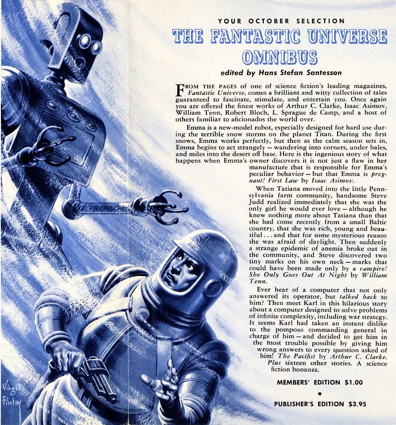
The Fantastic Universe Omnibus, featured in the
September-October 1960 issue of Things to Come. Art by Virgil Finlay

As I mentioned in Part One of this series, like tens of thousands of science fiction fans before and after me, I was at one time a member of the Science Fiction Book Club (or SFBC for short). I joined just as I entered my teen years, in the fall of 1976.

The bulletin of the SFBC, Things to Come, which announced the featured selections available and alternates, sometimes just reproduced the dust jacket art for the books in question. However, in many cases the art was created solely for the bulletin, and was not used in the book or anywhere else. Nearly all of the art for the first 20 years of Things to Come is exclusive to that bulletin, and as a result hasn’t been seen by many SF fans. In this series, I’ll reproduce some of that art, chosen by virtue of the art, the story that it illustrates or the author of the story. The first installment featured art from 1957 and earlier, while this installment covers 1958-1960, presented chronologically.

Read More Read More

The Secret World of Greg Ketter

The Secret World of Greg Ketter

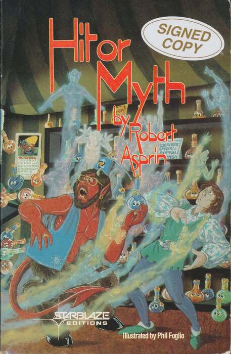
Hit or Myth by Robert Asprin (Starblaze, 1983). Cover by Phil Foglio

Greg Ketter, owner of Dreamhaven Books in Minneapolis, is one of the best booksellers in the business, and he’s sold me many fine volumes over the years. Greg doesn’t talk about it much, but he’s also friends with many of the most famous writers and artists in the field. This being a creative industry, Greg’s friendships reveal themselves in entertaining ways. In fact, Greg has been Tuckerized more than anyone else I know, and in some surprising ways.

I’ve been enjoying Greg’s tales of Tuckerization on Facebook. What is “Tuckerization?” Here, I’ll let Greg explain it.

Wilson “Bob” Tucker was an early SF fan who also went pro, writing mystery and science fiction stories alike. His first book, mystery novel The Chinese Doll, contained the names of many of his friends as characters. Thus you had been “Tuckerized.” The practice continues today sometimes with people paying great sums of money (usually for charities) to be included as characters in books. The most popular seems to be getting killed off in whatever silly/gruesome/disgusting/crazy way the author can dream up.

Greg’s namesake has appeared in George R.R. Martin’s Game of Thrones, Nick Pollata’s Satellite Night Fever, Joe Domenici’s Bringing Back the Dead, and many more. But my favorite story is the time he appeared on the cover of Hit or Myth, the fourth book in Robert Asprin’s popular and long running Myth Adventures series:

I was staying with Phil Foglio for a while when he said he needed a model for the new Robert Asprin Myth book. Sure, why not. So, I became a demon for Hit or Myth. Notice those ripped abs (actually, back then I was a bit closer to that than I am now. Everything has dropped down a ways since then). I helped with some of the atrocious puns scattered about the cover and Phil named the place “K’tier Abu’s Djin Mill” as a nod to his old buddy.

I leave it as an exercise to the reader to spot all those visual puns Greg mentions. Just about every one of my friends in Ottawa back in the day read Asprin’s Myth Adventures series, and the books were scattered around our house when I was in University. It’s quite the kick to discover that’s I’ve secretly known the cover model for the demon Aahz all these years. Small world.

Adventures in Art Collecting: Windycon XXX

Adventures in Art Collecting: Windycon XXX

Art from the Gordon R Dickson collection: Cover to Sleepwalker’s World
(DAW, 1972) and The Pritcher Mass (DAW, 1973). Art by Kelly Freas

When folks ask me for advice on how to collect original science fiction and fantasy art, I pass along some tips I’ve learned, but I also tell them that sometimes, you just have to get lucky. Case in point…

Classicon is a one day pulp and paperback show near Lansing, MI, generally held twice per year (at least when things are normal!). It’s organized by a friend of ours, Ray Walsh, who owns Curious Book Shop. Back in 2003, the fall edition of Classicon was to be held on November 9, and Deb and I planned on attending.

That same weekend, the Chicago area’s largest science fiction convention, Windycon, was taking place (Windycon XXX, which ran November 7-9, 2003). We weren’t able to go to Windycon that Friday due to work, but decided to make a short detour to it as we drove to Michigan on Saturday. We planned to just spend an hour or so there, to drop off fliers for the 2004 Windy City Pulp and Paper Convention, take a quick tour through the dealer room and art show and say hi to some friends.

All was going to plan until we made the last of our stops and entered the art show. As we walked in, we spotted two of our friends, Bob Weinberg and Alex Eisenstein, in close conversation. Walking over to them, they didn’t seem quite as excited to see us as we were to see them. They kindly remarked, quite insistently, that there was nothing to see here, and that our time would be better spent anywhere else other than at the art show. Not surprisingly, their helpful advice immediately raised our suspicions, and they soon came clean.

Read More Read More

The Art of Things to Come, Part 1: 1953-1957

The Art of Things to Come, Part 1: 1953-1957

TTC 1957 03-04 Isaac Asimov The Naked Sun-small

The Science Fiction Book Club’s Things to Come bulletin, March-April 1957

Like tens of thousands of science fiction fans before and after me, I was at one time a member of the Science Fiction Book Club (or SFBC for short). I joined just as I entered my teen years, in the fall of 1976, shortly after I discovered the wonder of science fiction digests.

I remember the bulletin of the SFBC, Things to Come, arriving in our mailbox every month, and eagerly perusing the offerings to see if I wanted grab any of the featured selections or alternates, or something from the backlist. The SFBC purchase I most vividly recall reading was the Isaac Asimov edited anthology, Before the Golden Age, which was filled with great stories as well as fascinating biographical material by Asimov on his early days as a fan. Other favorite volumes include Leigh Brackett’s The Book of Skaith, Damon Knight’s Science Fiction of the Thirties and The Futurians, Frederik Pohl’s The Early Pohl, Frank Herbert’s Dune series and Edgar Rice Burroughs’ Mars books, among many others. I remained a member through college before finally letting my membership lapse.

One of the benefits of being a member of the SFBC was receiving their bulletin, Things to Come. While the art inside sometimes just reproduced the dust jacket art, in many cases the art was created solely for the bulletin, and was not used in the book or anywhere else. Because one can never collect enough things, I gradually started collecting back issues of Things to Come for the art, particularly for the art of Virgil Finlay which began appearing in the bulletin in 1959. In 2005, I gathered those Finlay illos from the bulletins that I’d collected and published a small press booklet, Virgil Finlay: The Art of Things to Come.

Read More Read More

The Art of Author Branding: The Berkley Poul Anderson

The Art of Author Branding: The Berkley Poul Anderson

Poul Anderson Homeward and Beyond-small Poul Anderson Trader to the Stars-small Poul Anderson Tao Zero-small
Poul Anderson The Trouble Twisters 2nd-small Poul Anderson Satan's World-small Poul Anderson Mirkheim-small


The first six of what would eventually be fourteen Berkley Poul Anderson paperbacks with this design,
including the first three books of the Polesotechnic League. Covers by Rick Sternbach
(Satan’s World) and Richard Powers (all others). July 1976 – December 1977

Back in May, inspired by Mark R. Kelly’s review of one of the very first science fiction novels I ever read, the 1977 Ace paperback edition of Robert Silverberg’s Collision Course, I took an extended look at Silverberg’s mid-70s career at Ace, and how the marketing department gave his books a distinct visual identity — one very different from the way his novels were later packaged at Berkley, Bantam, Tor and others.

In many ways this kind of author branding reached its zenith in the late 70s, and in the Comments section of that article there were plenty of suggestions for examples I should look at next. Joseph Hoopman suggested Avon’s black-bordered Roger Zelazny (great choice!) and their vintage A. Merritt, Charles Martel mentioned the distinctive Laser Books cover series by Kelly Freas, Thomas Parker expressed fondness for Frank Frazetta’s Ace paperback covers for Edgar Rice Burroughs, and Bob Byrne suggested Tim Hildebrandt’s gorgeous covers for the first half-dozen Garrett, PI books by Glen Cook, among other ideas.

All good choices, and if fortune holds I’ll look at many of them. But today I want to highlight a set of paperbacks more contemporary to the Ace Robert Silverberg — the 14 Poul Anderson volumes published by Berkley and Berkley Medallion between 1976 – ’79.

Read More Read More

Goth Chick News: A New Monster from Harry Potter Creator J. K. Rowling

Goth Chick News: A New Monster from Harry Potter Creator J. K. Rowling

The Ickabog

Shortly following the advent of the zombie apocalypse which caused us all to seek shelter in our homes and increase our body fat to survive potential food shortages, Harry Potter author J. K. Rowling had an idea. Back in 2012 she began writing a new kind of children’s story which she read to her two younger kids, then aged 7 and 9 respectively, a chapter at a time as she created it. However, when it was done, she decided to publish the first of her adult mystery series, The Cuckoo’s Calling instead, and the completed children’s story went into the attic.

However, when the zombies came and we all went into hiding, Rowling understood the situation was particularly difficult for children. She went to the attic and dusted off her story and decided it might be a good way to provide some entertainment for the kids, who would otherwise have been finishing school, then enjoying their summer. She decided she would publish the story online for free, as so many parents were experiencing financial hardship, and new books might be pretty far down the line of priorities.

So, in May of this year, the first two chapters of The Ickabog appeared on its own, brand new website. Rowling then released a chapter or two every few days over the next seven weeks, and a week ago, the final chapter (number 64) was posted. In addition, Rowling provided her young readers with suggestions for illustrating her story. She invited them to send her their artwork, from which would be chosen a series of pictures to be included in the print version of The Ickabog, set to be released in November 2020.

And of course, I read it. No actually I devoured it, like the Ickabog devoured…

Never you mind, no spoilers here.

Read More Read More

The Importance of Good Fantasy Art

The Importance of Good Fantasy Art

FrankFrazettaConan-small MichaelWhelanStormbringer-small JeffreyCatherineJonesSwordsAndDeviltry-small

Art by Frank Frazetta, Michael Whelan, and Jeffrey Catherine Jones

An adventure tale isn’t good just because it features a bare-chested hero and a sword, and neither is a painting. Stories and art are successful because they are created by talented people who have devoted long hours (usually 10,000 or more) to educate themselves about their field and develop the proper skills and style to express that talent. And the presentation of that talent is absolutely vital to the success of the fantasy genre — creatively, culturally, and commercially.

In Flame and Crimson: A History of Sword and Sorcery, Brian Murphy discusses the root causes of the sword and sorcery revival of the 1960s:

…published in paperback with arresting covers by the most talented artist ever to work in the subgenre, the convergence of authorial and visual artistry, marketing, and business acumen led to the re-emergence and conscious reawakening of sword-and-sorcery in the subgenre’s “silver age,” or renaissance.

No doubt all those elements were important, but I can guarantee you that those books never would have sold in those numbers without that great cover art by Frank Frazetta.

Read More Read More

The Art of Author Branding: The Ace Robert Silverberg

The Art of Author Branding: The Ace Robert Silverberg

The Seed of Earth Silverberg-small The Silent Invaders Silverberg-small Recalled to Life Silverberg-small
Next Stop the Stars Silverberg-small Collision Course Silverberg-small Stepsons of Terra-small

The Ace Robert Silverberg: skewed titles and unclutterd art. The Seed of Earth, The Silent Invaders, Recalled to Life,
Next Stop the Stars, Collision Course and Stepsons of Terra. All from 1977. Covers by Don Punchatz

If you cruised the bookstore and supermarket racks in the 70s and 80s for science fiction paperbacks, Robert Silverberg was everywhere. I mean, everywhere. It wasn’t just that he was enormously productive — that was certainly true. But his books remained in print, or were returned to print, countless times by different publishers.

This was the era when agents would package up backlists by top writers en masse, selling the rights to multiple novels, and publishers would release them virtually simultaneously, usually with the same cover artist. If you had a popular novel — and Silverberg had many — a diligent agent could package and re-package it many times. That’s how Silverberg’s Hawksbill Station was released by Doubleday, The Science Fiction Book Club, Avon, Tandem, Berkley, Star, Warner Books, Tor, and many others between 1968 and 1990, just to pick one example.

The 1977 paperback edition of Robert Silverberg’s Collision Course was one of the first science fiction books I bought (the other was Star Trek 2, by James Blish). Mark Kelly reviewed it for us here last month, calling it “a fascinating, ordinary 1950s science fiction novel.” The mix of far-flung space adventure and galactic intrigue was perfectly pitched for a 13-year old however, and I loved it. Naturally I returned to the bookstore to find more in the same vein, and lo and behold, I did: five more Robert Silverberg novels, cleverly packaged by Ace Books to capitalize on the natural brand loyalty of young SF fans (see above).

This practice of bundling authors, and creating custom cover designs for each, was by no means unique to science fiction, of course. But if you’re a student of SF art there’s an enormous amount to learn by examining the visual language built up around the most popular SF authors in the 70s and 80s, and the ways editors and Art Directors at the major publishers used that language to draw in readers with familiar images and themes, and simultaneously differentiate themselves from the competition on overcrowded paperback racks.

There are countless examples, of course. But for our purposes, I’m going to single out Robert Silverberg, mostly because he’s the one I think of when I think of author branding. Well, Silverberg and Larry Niven (whom we’ll get to in a minute).

Read More Read More