Browsed by
Category: Art

Vintage Treasures: The Ghatti Tales of Gayle Greeno

Vintage Treasures: The Ghatti Tales of Gayle Greeno

Sunderlies Seeking-small The Farthest Seeking

When I was running SF Site in the late 90s, I got hundreds of review books every year. Many appealed to me, though I had time to read almost none, and instead assigned them to our freelance reviewers. (Isn’t that always the way? You can have plenty of books, or you can have plenty of time, but you can never have both.)

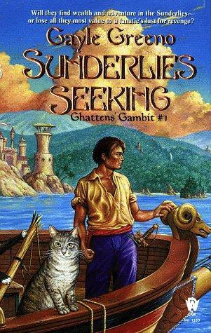
Anyway, in the intervening 15+ years, I’ve long since forgotten most of the delightful volumes that passed through my hands. Yesterday I was in my basement — excuse me, the Cave of Wonders — making room for recent arrivals, packing up nearly a thousand old review copies to store in the attic, when I came across my dust-covered copy of Sunderlies Seeking, the first novel in Ghatten’s Gambit, a two-volume fantasy series published by DAW in 1998 and 2000.

I did remember Sunderlies Seeking. Even after 17 years, I recalled Mark Hess’s great cover and the evocative description on the back, promising a tale of adventure in a land of “convicts, rebels, and the unwanted refuse of society.” Not to mention a pair of friendly cats on the cover, helping sail a ship into the harbor. I’d never heard of author Gayle Greeno before Sunderlies Seeking crossed my desk in 1998, but after it did I sought out her other novels with great interest.

Read More Read More

Relaunched Weirdbook Scores a Stephen Fabian Cover

Relaunched Weirdbook Scores a Stephen Fabian Cover

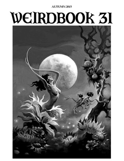
Weirdbook 31-smallEarlier this month I was very pleased to report that one of the greatest of all weird fiction magazines, W. Paul Ganley’s Weirdbook, is relaunching, with David A. Riley as Senior Editor and Publisher, and Douglas Draa, former Online Editor for Weird Tales, as Managing Editor and Fiction editor.

Last week on his blog David Riley revealed the cover for the upcoming Weirdbook 31, with art by none other than the great Stephen Fabian (at right; click for bigger version).

We are very pleased to be able to reveal the cover for issue 31, the first of the new Weirdbooks. It’s the work of Stephen Fabian, whose art often featured on earlier copies of the magazine.

Indeed, Fabian’s cover art was a hallmark of the original Weirdbook, and I’m thrilled to see that David and Doug have managed to secure him for issue 31. I’m certain it will make old-timers like me feel right at home.

You can see more of Fabian’s artwork in our detailed look at Stephen E. Fabian’s Ladies & Legends last year, and read more about Weirdbook (including their recent call for book reviewers) at David’s blog. They expect to have issue 31, the first issue of the relaunched magazine, available by the end of August this year.

Vintage Treasures: Not Without Sorcery by Theodore Sturgeon

Vintage Treasures: Not Without Sorcery by Theodore Sturgeon

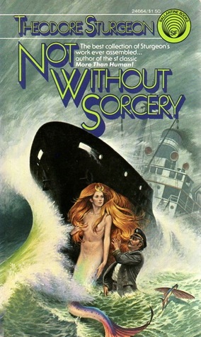
Not Without Sorcery 1961-small Not Without Sorcery-small

Theodore Sturgeon’s first short story collection was Without Sorcery, a handsome hardcover published in 1948 with an introduction by Ray Bradbury. As you can imagine, it’s a tough book to find these days, even for collectors.

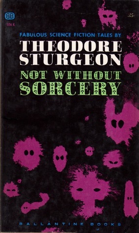
The paperback edition, released 13 long years later, dropped five stories and the introduction, and was re-titled Not Without Sorcery. It became Sturgeon’s tenth collection and was released in two editions, from Ballantine (in 1961, with a rather drab cover by an unknown artist) and Del Rey (in 1975, with a far more interesting cover from artist Darrell K. Sweet.) 1975 was the last time the book saw a mass market edition; it remained out of print for 35 years, until Kessinger Publishing did a facsimile reprint edition in 2010.

Sturgeon was a Campbell writer through and through, and all eight stories in Not Without Sorcery appeared in the two pulp magazines John W. Campbell edited: Astounding Science Fiction, and its sister magazine Unknown Worlds. The stories were published over a two-year period, 1939-1941. I’ve assembled some of the original covers below, because I can never resist an excuse to showcase pulp magazines.

Read More Read More

Vintage Treasures: The Boats of the Glen Carrig by William Hope Hodgson

Vintage Treasures: The Boats of the Glen Carrig by William Hope Hodgson

Famous Fantastic Mysteries June 1945-small The Boats of the Glen Carrig-small The Boats of the Glen Carrig Grafton-small

The Boats of the Glen Carrig was first published in 1907, and it has been reprinted countless times over the last hundred years. It is currently in print in no less than five separate editions, including multiple digital formats. In virtually every sense it is a classic horror novel, by one of the great 20th Century horror writers.

It wasn’t always recognized as such. In fact, after its first appearance, it languished for decades, before it was showcased in Famous Fantastic Mysteries in June 1945, with a terrific cover by Lawrence. It was reprinted in the seminal omnibus volume The House on the Borderland and Other Novels the following year, one of the most important and collectible volumes Arkham House ever published.

Read More Read More

The Daily Beast on the Surreal Science Fiction Art of Richard Powers

The Daily Beast on the Surreal Science Fiction Art of Richard Powers

The Man in the High Castle Richard Powers-smallRichard Powers was one of the greatest paperback artists of all time. He revolutionized science fiction art in the early 1950s, and over the next four decades — during which he painted some 1,200 cover illustrations for SF and fantasy novels, including Arthur C. Clarke’s Against the Fall of Night (1954), Kurt Vonnegut, Jr. ‘s The Sirens of Titan (1959), and Philip K. Dick’s The Man in the High Castle (1974) — he was one of the most instantly recognizable artists on the shelves.

Over at The Daily Beast, author Mark Dery kicks off what he promises will be a series of articles celebrating book cover art and design with a detailed look at Richard Powers, sampling some of his most famous covers.

Haunted moonscapes. Alien cenotaphs whose shadows stretch from here to forever, tracing the geometry of dreams. Emissaries from the unconscious, their features running like melting wax. Cancerous cities a trillion light years from now, the undifferentiated growth of their lumpy, tumorous sprawl now silent, still as a fumigated wasp’s nest. Richard M. Powers’s science-fiction book-jacket landscapes are usually depopulated but not always: sometimes, a splinter of a man — an inch-high relative of one of Giacometti’s stick figures — stands alone in the emptiness, contemplating infinity…

Robert de Graff had launched the paperback revolution with his Pocket Books in 1939 and now publishers like Jason Epstein at Doubleday and Ian and Betty Ballantine at Ballantine Books were in the thick of it…. The Ballantines believed in science fiction as a literature of ideas, not gadget porn for ham-radio buffs, so when they opened their doors in 1952 they thought of Powers. His modernist sensibility, steeped in things seen at New York’s Museum of Modern Art, set him apart from the pulp-magazine style — astronauts rippling their pectorals at bug-eyed aliens while space babes cowered in fear — that had dominated the genre for decades. “One of the things that appealed to me about science fiction,” he says, in The Art of Richard Powers, “is that it was possible to do Surrealist paintings that had validity … in their own right, and not necessarily functioning as the cover of a book.”

Read the complete article here.

Vintage Treasures: Book of the Isle by Nancy Springer

Vintage Treasures: Book of the Isle by Nancy Springer

The White Hart-small The Silver Sun-small The Sable Moon-small

I have to admit that I was always confused by this series. For several decades, to be perfectly honest.

The problem was that I could never quite figure out what order the books were meant to be read in — or even how many there were. I never did sort it out it on my own… in my first draft of this article, I arranged them in the wrong order, and I was convinced I was missing a volume. (I wasn’t.) I eventually had to turn to ISFDB and Wikipedia to get a definitive answer.

Anyway, the end result was that I never read them, despite having the entire series on my shelves (filed in the wrong order) for over 30 years. I guess it’s true what they say: books are like pretty girls… if they make you feel awkward and stupid, you rarely ask them out.

Read More Read More

Vintage Treasures: Sheila Gilluly’s Greenbriar Trilogy

Vintage Treasures: Sheila Gilluly’s Greenbriar Trilogy

Greenbriar Queen-small The Crystal Keep-small Ritnym's Daughter-small

Sheila Gilluly had a brief career as a fantasy writer. She published two trilogies in the late 80s and early 90s, and has produced nothing else for the last 20 years. But I’ve always been curious about her Greenbriar Trilogy — composed of Greenbriar Queen (1988), The Crystal Keep (1988), and Ritnym’s Daughter (1989) — mostly because of the beautiful covers (click the images above for bigger versions). I’ve tried to identify the artist, but the art is uncredited in my copies, and so far an internet search has been fruitless.

Greenbriar Queen opens in a pretty dark place, with the Dark Lord’s reign about to begin, the heroes scattered, the king dead, and a traitor on the throne. If you like high stakes and desperate battles, The Greenbriar Trilogy might be for you.

Read More Read More

Art of the Genre: The Art of the Iconic Character

Art of the Genre: The Art of the Iconic Character

Predating Paizo by a decade and a half...
Predating Paizo by a decade and a half…

By Webster’s definition, Iconic means ‘of, relating to, or having the characteristics of an icon’, which in essence reminds me of looking for the Wizard’s 1E D&D Protection from Evil spell only to be told to ‘see Cleric spell of the same name’, unless, of course, you know the word Icon means ‘a person who is very successful and admired’.

Now, having established the meaning, I intend to look at the evolution of ‘Iconic Characters’ [thus Iconic Character Classes] in the RPG setting.

It can be universally accepted that Paizo coined the phrase ‘Iconics’ with the release of its Pathfinder Adventure Paths [and their beta versions from Paizo’s Dungeon Magazine], but that is simple semantics.  In reality, the first true ‘Iconics’ were from the Wizard of the Coast release of D&D 3rd Edition, namely Krusk, Jozan Vadania, Tordek, etc.

These characters were really the first to take players through the game by repeating their exploits in both artwork and description.  Created by artists Todd Lockwood and Sam Wood, players from a whole new D20 generation were introduced to this new system and cut their teeth with the WotC Iconics.

However, I would contend that perhaps the definition of Iconic doesn’t have to depend on players of RPGs actually knowing the character’s name, but rather recognizing their image.  If that is the case, then the role of character class Iconics goes back much further.

Read More Read More

The Omnibus Volumes of Jack Vance, Part II: Tales of the Dying Earth

The Omnibus Volumes of Jack Vance, Part II: Tales of the Dying Earth

Tales of the Dying Earth-smallI’ve been reading Jack Vance recently. My interest was initially piqued by the beautiful collections of his earliest stories from Subterranean Press, The Early Jack Vance, including the upcoming fifth book, Grand Crusades. Two weeks ago I started a project to examine the current crop of omnibus volumes collecting his most popular series, starting with Planet of Adventure.

Part of the reason I do this, of course, is that these books are a terrific value for collectors and new readers alike, gathering as they do multiple novels — many of which have been out of print for decades — in inexpensive trade paperbacks. But seeing these fat volumes on bookshelves doesn’t always do anything for me… until I have a clear picture of exactly what’s inside.

I’m a visual guy, so for me that usually means the covers of the original paperbacks. Once I see those, these handsome omnibus volumes become a lot more desirable.

Of course, we’re dealing with Jack Vance here. His books were some of the most popular fantasy of the Twentieth Century, and went through multiple editions from a whole host of publishers. And his Dying Earth novels are perhaps his most popular and enduring works — I count more than two dozen English language editions just of the first book alone, since it first appeared in paperback in 1950.

So that presents a bit of a quandary. What I’m aiming to do here is provide a snapshot of the books contained within Tales of the Dying Earth that will jog the memory of the casual reader… perhaps remind them of that fascinating paperback they picked up at the cabin back in 1979, or that forgotten series they briefly glimpsed on bookstore shelves in 1994. I won’t attempt to catalog every appearance of the four novels in the Dying Earth sequence here, but instead just focus on the most popular editions that have been in circulation for the last sixty years or so.

I hope that if this article does jog your memory, perhaps reminding you of that long-forgotten paperback copy of Eyes of the Overworld or Rhialto the Marvelous you devoured twenty summers ago, you’ll seek out one of these omnibus editions and give it a try. The publishers who have brought these vintage classics back into print deserve your support.

Read More Read More

Vintage Treasures: Damnation Alley by Roger Zelazny

Vintage Treasures: Damnation Alley by Roger Zelazny

Damnation Alley hardcover-small Damnation Alley Berkley Medallion-small Damnation Alley Movie tie-in-small

Roger Zelazny is one of my favorite authors. He wrote a wide range of fantasy, from Hugo-winning science fantasy (the brilliant Lord of Light) to a wildly original epic (the ten-volume Chronicles of Amber) to Sherlock Holmes-Lovecraft pastiche (A Night in the Lonesome October). Only one of his novels has ever been adapted for the screen, however: his post-apocalyptic adventure Damnation Alley, first published in hardcover by Putnam in 1969 (above left, cover by Jack Gaughan).

The book follows Hell Tanner, a condemned murderer, who’s offered a pardon if he will attempt a suicidal run across the blasted terrain from L.A. to Boston to deliver a plague vaccine. Tanner faces radioactive storms, 120-foot-long snakes, killer bats, giant mutated scorpions, and desperate human survivors as he traverses the thin habitable zone zig-zagging across the nuclear-scarred ruins of America.  The movie, which barely rises above the level of camp, was expected to be a major blockbuster. But it had the misfortune to be released the same year as Star Wars, and it sank without a trace.

The movie did a lot of things wrong… but one thing it did right was to focus much of the marketing on Tanner’s sweet ride: the Landmaster, a gigantic, grenade-throwing, nearly impenetrable all-terrain vehicle. It was custom designed for the film. Only one was every built — at a staggering cost of $350,000 in 1976 — and it still survives today. That’s why it pays to get the extended warranty, especially during periods of nuclear armageddon.

Read More Read More