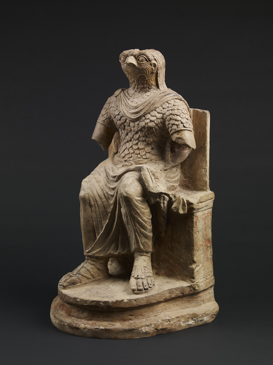
Ancient Egypt is famous for its elaborate religion with a multitude of deities and an obsession with the afterlife. While there have been many exhibitions on ancient Egyptian religion, it’s rare to see one that traces Egypt’s transformation from a land that was mostly pagan to one that was mostly Christian, then mostly Muslim, with a strong tradition of Judaism running through it.
Now a major exhibition at the British Museum, Egypt: Faith after the Pharaohs, uses about 200 objects to explore the history of religion in this fascinating country. The first gallery emphasizes that Egypt still has a sizeable Christian community. While that community has been targeted by extremists in recent years, there is also a large amount of cooperation between the two faiths. Photos from the Arab Spring show Christians making a protective ring around Muslims as they pray, and the Muslims returning the favor around churches on Sunday. The Western media tend to skip these stories of tolerance for more ratings-friendly tales of bloodshed, thus giving a skewed picture of the situation. As one of my old newspaper editors said, “If it bleeds, it leads.”
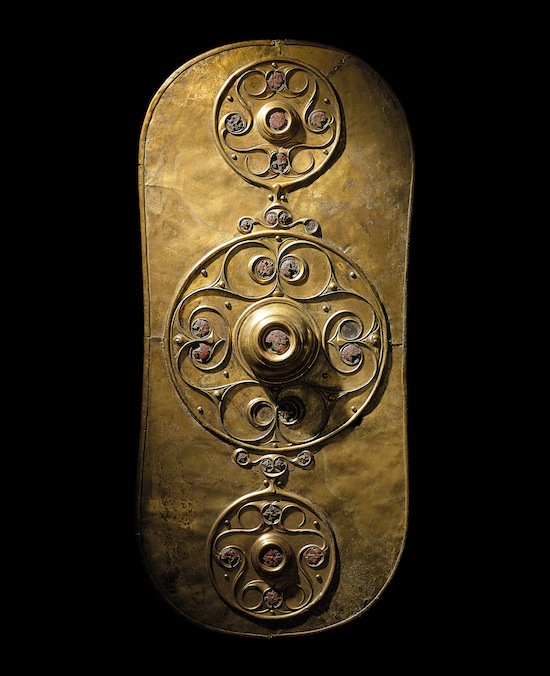
For many of us, the Celts are an enduring fascination. Their art, their mysterious culture, and the perception that so many of us are descended from them makes the Celts one of the most popular ancient societies. So it’s surprising that the British Museum hasn’t had a major Celtic exhibition for forty years.
That’s changed with Celts: Art and Identity, a huge collection of artifacts from across the Celtic world and many works of art from the modern Celtic Revival. The exhibition is at pains to make clear that the name ‘Celts’ doesn’t refer to a single people who can be traced through time, and it has been appropriated over the last 300 years to reflect modern identities in Britain, Ireland, and elsewhere. “Celtic” is an artistic and cultural term, not a racial one.
The first thing visitors see is a quote by some guy named J.R.R. Tolkien, who wrote in 1963, “To many, perhaps most people. . .’Celtic’ of any sort is. . .a magic bag into which anything may be put, and out of which almost anything may come. . .anything is possible in the fabulous Celtic twilight.”
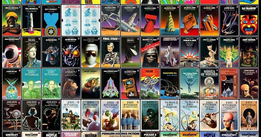
Tor.comis reporting that legendary paperback artist Richard Powers, who illustrated hundreds of science fiction and fantasy paperbacks, has been inducted into the Hall of Fame by the Society of Illustrators.
Richard Powers began illustrating covers for American paperback publishers in 1950. He was extremely active in the 50s, 60s, and early 70s, painting hundreds of covers for Berkley, Ballantine, Putnam, Doubleday, and many others. He died in 1998, and was inducted into the Science Fiction Hall of Fame in 2008.
The Society of Illustrators has been electing artists recognized for their ““distinguished achievement in the art of illustration” into the Hall of Fame since 1958. The newest Hall of Fame inductees include Beatrix Potter, Peter de Seve, Marshall Arisman, Guy Billout, Rolf Armstrong, and William Glackens.
Click on any of the images above to see Powers’ artwork in all its high-resolution glory.
It is hard to believe that David Farney and I started Heroic Fantasy Quarterly in the waning half of 2009. Six years ago; and internet years are like dog years so that’s, well, that’s a long time.
It’s also hard to believe that we’ve been talking about this best-of idea since 2013! We finally did it, though, and made hard choices from our first eight issues to bring out the best work, summoned the incredible skills of artist Justin Sweet, and even brought Black Gate‘s own John O’Neill in on it.
And now it is a real thing, available for pre-order and going live/shipping on Black Friday.
Our table of contents:
Introduction: “Over the Hills and Far Away…and Hiding Right Next to You” by John O’Neill
Back in the age of print magazines, I made my first professional sale to a fellow named John O’Neill who published a gorgeous quarterly called Black Gate. We went through three deep revisions on that manuscript, a process we both enjoyed enough that, after I finally produced a version of “The War of the Wheat Berry Year” good enough for John to buy, he asked if I had anything else featuring that heroine. And I did. To our surprise, my novella “The Imlen Bastard” needed only a little polish to be ready for print. And so it took its place in the publication queue. Forthcoming from Black Gate, I said of it in my author bio all over the internet, for a few years.
Those years were hard on print magazines, and they weren’t much kinder to online fiction markets. “The War of the Wheat Berry Year” appeared in BG‘s last print issue. Ultimately, John stopped publishing fiction online before “The Imlen Bastard” could make its debut here.
But to me it’ll always be a Black Gate story.
So when I found an artist, Kate Baylay, whose work felt like my favorite old BG print covers — luscious, menacing, full of subtle story implications — I knew I’d found the right cover artist for “The Imlen Bastard.” Everything else I wanted to do with the self-publishing project that has grown up around the novella came together for me quickly after that. Best of all, Kate Baylay embraced the manuscript, and we’ve had so much fun going over the story together to find the most iconic moments for interior illustrations.
Then I enlisted superstar editor Betsy Mitchell — now retired from Del Rey after a career of editing people like Naomi Novik, Michael Chabon, William Gibson, and Octavia Butler — to give the novella an editorial boost. I figured, there’s a difference between standing as the longest piece in a magazine issue and standing alone as a book. I’m still kind of amazed that she took me on as a freelance client, when she’s in a position to work only on manuscripts she really enjoys. So that boded well.
At first, we all agreed that I’d launch a Kickstarter campaign over the summer, but then I got shortlisted for the Mythopoeic Fantasy Award. I held off on self-publishing for a few months so I’d know whether to say Finalist or Winner in my promotional material. After the award, I needed to readjust my hubris levels — a story that’s done me the kindness of coming to me to be written deserves the best promotion I can give it, and now I had to work up more brazenness than ever before on my stories’ behalf. Brazenness is harder than it looks. This month, with the thank-you notes for the award all written and sent out, and a trophy to feature in my Kickstarter video, it was finally time.
I clicked on the launch button at noon. You can find the campaign here.
Stephen Jones’s The Art of Horror: An Illustrated History, a gorgeous full-cover coffee table book, was published by Applause Theatre & Cinema Books in hardcover on September 1, 2015. It’s a beautiful retrospective of horror in theater, cinema, pulps, paintings, book illustrations and comics, and it’s the kind of book you really need to see to fully appreciate.
I’ve collected a handful of full color images from the book to give you a small taste of the wonders that await you in this oversized, 260-page tome. Have a look below (click on the images for full-sized versions.)
Two weeks ago I posted an article about Thomas Ligotti’s new Penguin collection Songs of a Dead Dreamer and Grimscribe. I was quite taken with the cover art, but was unable to track down the name of the artist. In the Comments section, Robert Adam Gilmour correctly fingered the artist as Chris Mars, with a piece titled “Puppeteer.”
While confirming the details, I educated myself on the entirely splendid and macabre art of Mr. Mars. His work is simultaneously gleefully traditional — filled with spooky landscapes and close set, haunted villages — and relentlessly modern, refusing to give us what our eyes expect, instead cramming every inch of his canvas with vibrant colors and tortured visages. A fine example is the above piece, titled “Trial by Smoke.”
But as they say, writing about art is like dancing about architecture. I’ve collected a few of my favorite samples of Mars’ art below, so you can see for yourself.
Back in July, in a post on Sidney Paget, I wrote “Along with Frederic Dorr Steele, Paget is certainly one of the two most significant illustrators of the great detective.” Having covered Paget, now we look at Dorr Steele.
In 1893, Doyle, feeling that writing Holmes stories was holding him back from more important works, did the unthinkable: he killed the world’s most popular detective. In 1902, he revived Holmes for one adventure in his most famous story, The Hound of the Baskervilles, with good old Sidney Paget illustrating again. Doyle made it clear this was an earlier case of Holmes’ and that the great detective was, in fact, still dead.
The stories from The Adventures of Sherlock Holmes and The Memoirs of Sherlock Holmes had been illustrated by various artists in America, where they appeared in different magazines and newspapers. There was no sole source for the stories, as there was in England with The Strand. For the most part, the drawings were rather uninspired
Some of Paget’s were also used, but often just a few, not the full set for each story. Thus, a common image of Holmes had not evolved from the drawings. There was no Sidney Paget in the United States. But there was about to be!
Back when I was a teenager in the 1970’s, I was a big fan of the Perry Rhodan series.
The English edition was published by Ace Books, and edited by Forry Ackerman. Forry offered subscriptions to the series, and I started subscribing as soon as I found out about the series.
The primary cover artist for the first 100+ issues was Gray Morrow. Morrow’s cover for #50, “Attack From the Unseen,” showed Perry posing heroically.
In 1976, Ace ran a survey in the back of issue #s 86-91, offering a free poster of the cover for #50 if you cut out the survey and returned it to Ace. I filled out my survey the day I got #86 in the mail, and sent it back immediately.
And then I waited. And waited. And waited. And no poster ever showed up. I’ve never seen one of these posters, have never heard of anyone who actually got one, and don’t think they were ever printed. My disappointment with Ace over this was deep.
Fast forward 28 years to the 62nd Worldcon, Noreascon 4, held in Boston. Prior to the convention, Deb and I visited our friend, Jerry Weist, and his wife Dana, who lived in the area. While going through stacks of art in Jerry’s flat files, I was astounded to find the original Gray Morrow painting for Perry Rhodan 50!