A Tale of Two Covers: Alan Baxter’s Crow Shine and Sarah Remy’s The Bone Cave
 |
 |
This week’s Tale of Two Covers looks at two very similar covers, released a month apart late this year. (Click the images above for bigger versions.)
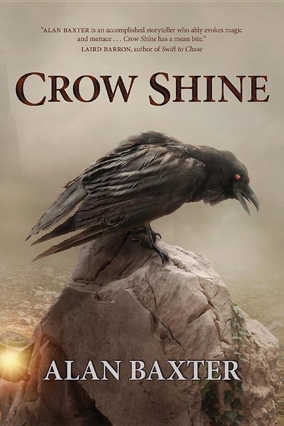
The first is Crow Shine, published by the Australian independent publisher Ticonderoga Publications on November 11, 2016. Crow Shine is the debut horror collection from Australian dark fantasy writer Alan Baxter, and it gathers stories from F&SF, Beneath Ceaseless Skies, Postscripts, and multiple anthologies. You can read more about it at the Ticonderoga website, but unfortunately it doesn’t identity the cover artist.
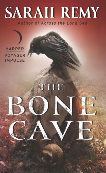
The second is The Bone Cave, published in paperback yesterday by Harper Voyager Impulse. It’s the third volume in Sarah Remy’s Bone Magic series, following Stonehill Downs (2014) and Across the Long Sea (2015). See all the details at the publisher’s website here. Like Crow Shine, the cover artist is uncredited.
While both books clearly make use of the same base image, there are also interesting design differences. Note the lamp affixed to the rock in the cover on the left (missing on the right), and the skull at the base of the rock on the right. They’ve also gone with different color schemes — Crow Shine is a pale white, almost green, and The Bone Cave has colored the entire background red.
The former has also zoomed in on the crow, while the book on the right has settled for a wider view. The title is on top and the author’s name at bottom for Crow Shine, while that’s flipped for The Bone Cave.
Speaking of flipped, the central image of Crow Shine is reversed in The Bone Cave, which helps accentuate the design differences.
Which design is superior? In cases like this I think you tend to prefer the first one you see, which for me was Crow Shine, and indeed I do have a fondness for that one. But I think the designers both did a fine job producing two distinctive covers from the same core image.
Our previous articles in the Tale of Two Covers series include:
The Last Page by Anthony Huso
Stand on Zanzibar by John Brunner
Ellen Kushner on Basilisk
Shadows and Tall Trees 7 edited by Michael Kelly
Both images have the lamp. On the right it’s hidden behind the “E” in Bone.
I prefer the image on the right; it doesn’t imply that a raven is a crow. 😉 (Although if I was familiar with The Bone Cave, it might.)
Just wanted to stop by and say I really love this comparison. I had little to do with Bone Cave’s cover design, other than giving an ‘A Okay’, but it’s really fascinating how the one image was used twice, and how the flavor changes just a BIT with the zoom and color choices.
Secretly I’ve always wanted to be a cover designer, but I haven’t the talent. The wheres and whyfors of graphic choices are always intriguing.
Thanks, John, for the cool post. And now I’ll have to read Alan’s CROW SHINE.
And Jeff, don’t worry, my bad boy is a raven.
[…] THEY LOOK ALIKE, THEY CAW ALIKE. …You could lose your mind! In “A Tale of Two Covers: Alan Baxter’s Crow Shine and Sarah Remy’s The Bone Cave”, Black Gate’s John O’Neill comments on the remarkably similar cover art on two disparate novels […]
Jeff,
> Both images have the lamp. On the right it’s hidden behind the “E” in Bone.
Right you are! Sharp eyes, sir.
> I prefer the image on the right; it doesn’t imply that a raven is a crow. ?
Speaking of sharp eyes… I need a guidebook just to tell the difference between ravens and crows. So I’ll take your work for it that this is a raven!
> Secretly I’ve always wanted to be a cover designer, but I haven’t the talent.
> The wheres and whyfors of graphic choices are always intriguing.
>
> Thanks, John, for the cool post. And now I’ll have to read Alan’s CROW SHINE.
Thanks for the comment, Sarah!
And I know exactly what you mean about wanting to be a cover designer, but lacking the knack for it. I bought cover art for 15 issues of Black Gate, but it wasn’t until I hired John Woolley as our cover designer that we were able to really DO things with it, like slap the Black Gate logo at the top without impinging on the art. Design can really make a book stand out on the shelves, but (like editing) it’s an ‘invisible art’ that most people never see.
In any case, congratulations on the publication of your book — and on a great design!
In these times, I think it’s a shame publishers fail to identify the cover artist! In this case I assume the image was sold once, used twice, once with cropping. Good post.
I can’t speak for the Impulse cover, but for my book, the cover design was done by Russell T Farr of Ticonderoga Publications. The base image itself is a stock image, that’s then been adapted by the graphic designers in question. Who made the original stock image I don’t know, but I’ll put money on the bet that’s it’s been used on more covers than only mine and Sarah’s.
> I can’t speak for the Impulse cover, but for my book, the cover design was done by Russell T Farr of Ticonderoga Publications.
Alan,
Thanks for letting us know. Apologies if that information was located somewhere I should have found it. I did look.
> Who made the original stock image I don’t know, but I’ll put money on the bet that’s it’s been used on more
> covers than only mine and Sarah’s.
And I’m sure you’d win that bet. However, at Black Gate, we’re only interested in the really good ones. 🙂
And congratulations on the publication of Crow Shine! Even if Jeff thinks it’s a raven.
Thanks, John! It’s a corvid, let’s all agree on that. 🙂 And I made a typo above – it’s Russell B Farr, not T!
I think the cover design is credited in the book, but not on the site as far as I know, so you didn’t miss anything.