Call for Backers! Artist Elizabeth Leggett Discusses Her Illustrations for DreamForge Magazine, and More!

 In the second of two interviews supporting DreamForge’s Year Two Kickstarter Campaign I had the privilege of interviewing Hugo Award winning artist, Elizabeth Leggett, who has provided several illustrations for DreamForge.
She has also illustrated for magazines such as Lightspeed, and art directed, Women Destroy Fantasy and Queers Destroy Science Fiction. But I’ll let Elizabeth and her gorgeous art speak for themselves.
Emily Mah: You’ve illustrated several stories for DreamForge, that I’m aware of. How many have you done for them and what were the stories?
Elizabeth Leggett: I have been profoundly lucky. DreamForge has found some of the most talented writers and they have let me play in their sandbox through illustration. The first two pieces I did for them was for Lauren Teffeau’s short story, “Sing! And Remember.” The first was the cover image and the second was a black and white design.
My next contract was for David Weber’s story, “A Certain Talent.” This one is close to my heart because I was not only allowed to illustrate the main character, but also conceptualize Jim Moore (Jane Lindskold’s husband) as the power player! Next, I needed to leave my comfort zone and illustrate Jennifer Donohue’s story, “The Fundamentals of Search and Rescue.” Good heavens. wreckage sites are a challenge to draw!
My last illustration for last year was for John Jos Miller, “The Ghost of a Smile.”

Cover illustration for Lauren C. Teffeau’s “Sing! And Remember”
When people look at your art, they’re often surprised to find out it’s digital. When people think of digital art, they tend to think of photomanipulation, not original paintings. Can you describe your workflow when you compose and paint a painting?
I have been thinking about this quite a lot lately. I think painting and digitalism are separate art forms. Painting is a closer relative to sculpture. It has texture, depth, and layers. If you run your hand over a painting, there are grooves and rises. Each of those “hills” reflects or shadows against light to create the overall effect. (My usual description is that it is “sculpting with salad dressing.”) There is nothing flat about paintings. That is part of their unspoken magic. They are at their core, three dimensional.
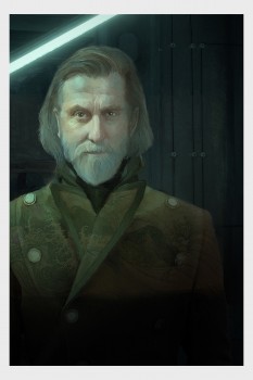
Illustration for David Weber’s “A Certain Talent”
Digitalism is more like music. There are tons of digital demonstrations, both online and live. Think of that as watching a concert. Keeping that example in mind, if you want to listen to that song again, you need a recording. It is not something you can hold in your hands unless you get a CD or vinyl copy. It is the same with digitalism. Unless you wish to bring the sax player home, (and well that is a different story entirely!), you can only hear his music on a “print” of his work. That is what digitalism does. If you want to experience it outside of watching the process, a recording of the final composition is the only way. It isn’t just a print. It is the music visualized.
I know this answer has gone around Robin Hood’s barn, but I think if we start to understand the differences, we can take out some of the stigma of this relatively new art form. I started as a painter. I think like a painter. My thumbnail brainstormings usually start in pencil and are generally ugly to anyone but me. They are only scribble notes. I use those to decimate my contrast environment, my palette hierarchy, and the “eye path” I want the viewer to take. I draw on a Wacom tablet and use Adobe software. I treat a piece the same way I would paint it. I used to feel badly about using texture filters, but then I remembered doing the same for paintings. Wadded up paper towels make great texture!
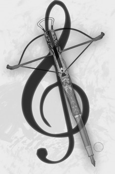
Interior illustration for Lauren C. Teffeau’s “Sing! And Remember”
So you’ve been a digital artist for most of your career, correct? If I recall correctly, you were one of the first artists to work in this particular medium and were a product tester for one of the original tablets. Can you tell us more about the hardware and software you use to paint?
Yes to all of that. In the early 90’s, Wacom and Adobe wanted to test their products with traditional painters. They wanted to see what problems we would have converting art forms. I was an oil painter at the time. My first tablet was huge and the programs were rudimentary, but I loved not having fumes in my life and well, there is something decidedly freeing about an undo button!
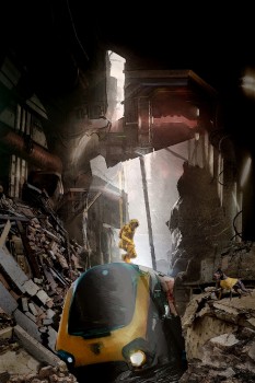
Illustration for Jennifer Donohue’s “The Fundamentals of Search and Rescue”
Of course, we can’t talk about your work without mentioning your most recent pieces, the READINGS series. Can you give us an overview of this series, which has been featured in Santa Fe’s KEEP Contemporary art gallery and George RR Martin’s Jean-Cocteau Cinema?
The READINGS series began as a bit of accident. I had taken a course on pitching and one of the primary suggestions was to ask the questions when the moment arose. In this case, Jared Trujillo, gallery owner of KEEP Contemporary, was making his 2019 schedule for showings. I got this wild hair and asked if he had anything scheduled for October. He said,”No. You want it?”
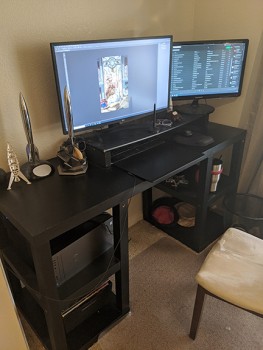
Where the magic happens!
I said yes without really thinking and then he asked what my theme was. I said, “I will tell you tomorrow.” I had no flipping idea what I was going to do. So I drove home and then went to my bookshelf. I have been carrying around the same copy of Ray Bradbury’s I Sing The Body Electric since high school. I called Jared back and told him I would do Ray Bradbury stories as interpreted through the major arcana of tarot cards. He said, “Sounds good, but I need you to bring in other artists, too.”
Thus began the READINGS gallery show. It was my first curation and exhibition in a gallery.
I have named my part of the show as the READINGS series. So far, I have completed the majors and have started the suit of swords. I showed the completed majors at KEEP and I showed some of the majors and premiered the King of Swords at the Jean Cocteau.
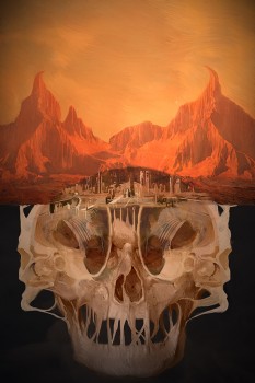
The Devil
Finally, I hear you are open for commissions. What’s your availability for original cover art and illustrations? What is the timeline to create something like original cover art for an author or publisher? And what’s the best way to contact you?
Yes! As it is still winter, I have slots still available in my schedule. It would be easiest to just email and we can discuss the projects. I can work quickly, but I prefer 6 weeks lead time. I have two emails that work well… elizabeth@archwayportico.com and archwayportico1@gmail.com.
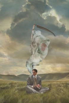
The King of Swords
Thanks so much, Elizabeth! And thanks for all of the gorgeous samples of your art. It was SO hard to choose which ones to include in this post. I’d have posted the entire READINGS series if I could…
Emily Mah is a writer and the owner of E.M. Tippetts Book Designs, a company that provides formatting and cover design services for independent authors and publishers. Her last post for Black Gate was about Derelict, a podcast by J. Barton Mitchell.