The Golden Age of Science Fiction: Titan Cover Art, by Paul Lehr
 |
 |
 |
Peter Graham is often quoted as saying that the Golden Age of Science Fiction is 12. I was reminded of this quote last year while reading Jo Walton’s An Informal History of the Hugo Awards (Tor Books) when Rich Horton commented that based on Graham’s statement, for him, the Golden Age of Science Fiction was 1972. It got me thinking about what science fiction (and fantasy) looked like the year I turned twelve and so this year, I’ll be looking at the year 1979 through a lens of the works and people who won science fiction awards in 1980, ostensibly for works that were published in 1979. I’ve also invited Rich to join me on the journey and he’ll be posting articles looking at the 1973 award year.
The Analog Award was launched in 1979 for works published in the magazine in the preceding year. The Best Cover category was added in 1980, so this was the first year the award was presented. The award has been given every year since then with the exception of the year covering works published in the magazine in 2002, when the award was replaced, for one year only, with a cover artist award, when it was won by David A. Hardy, who painted two covers for the magazine (May and December issues).
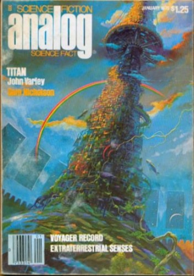
Paul Lehr painted the cover for the first installment of John Varley’s four-part serial for the novel Titan, which ran from the January to the April issue of Analog Science Fiction/Science Fact.
The artwork from the January 1979 issue of Analog seems to depict the spindle that runs up the center of the torus moon discovered in orbit around Saturn. The tower looks like a mixture of organic parts, wires, and high tech platforms growing out of a small globe and inside a massive dome. The night sky with other moons of Saturn can be seen through windows and a rainbow-like arc stretches behind the tower.
The painting appears to have been painted in the impressionist style and gives the sense that Lehr has included several details in the complexity of the tower which do not carry across in the reproduction on the magazine’s cover.
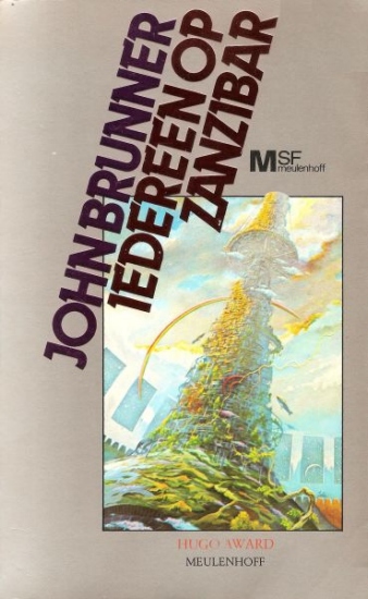
Lehr’s art for Titan would prove popular in Germany, where it was reused in 1980 on a translation of John Brunner’s novel Stand on Zanzibar and interior art in the the May issue of SF Perry Rhodan Magazin. In 1981, it was used as the cover for a German translation of Lloyd Biggle, Jr.’s The Whirligig of Time. The cropping and reproduction on the Brunner and Biggle show less of the painting, but the colors on the Biggle are more vivid than on the Analog cover, with the two blimps showing up much better on the Biggle cover than on the original. The Brunner cover appears much more washed out with a lot of the blues looking almost white and the dark greens of the tower looking like a lighter moss.
Lehr beat out cover illustrations by Robert McCall from the July 1979 issue which depicted Buzz Aldrin on the moon for the tenth anniversary of the Apollo 11 landing and Vincent di Fate’s cover for the December issue of the magazine showing a complex multi-stage rocket with the moon in the background.
 Steven H Silver is a sixteen-time Hugo Award nominee and was the publisher of the Hugo-nominated fanzine Argentus as well as the editor and publisher of ISFiC Press for 8 years. He has also edited books for DAW and NESFA Press. He began publishing short fiction in 2008 and his most recently published story is “Webinar: Web Sites” in The Tangled Web. Steven has chaired the first Midwest Construction, Windycon three times, and the SFWA Nebula Conference 6 times, as well as serving as the Event Coordinator for SFWA. He was programming chair for Chicon 2000 and Vice Chair of Chicon 7.
I’ve been a fan of Paul Lehr’s artwork for decades. You’re right about the bolder colors on the cover of Lloyd Biggle, Jr.’s The Whirligig of Time.
This raises a question, Steven: what kind of copyrights does an artist have over his/her work? I’d have thought the rights to this particular painting belonged to Analog, unless Lehr gave them only temporary use of the art. The end result of all three ‘versions’ suggests either inattention to the true colors of the original on at least two of them, or sloppiness on behalf of the printer(s), or license granted to the later versions to use them as might be seen fit. As the father of three daughters who could all make a living from their artwork (and two of them intend to try), I wonder what an artist ‘surrenders’ when he/she sells the art.
Terms and conditions will vary from contract to contract. When I was running ISFiC Press, we generally commissioned works with first printing rights, to revert to the author after a year, at which time they could reprint the artwork anywhere they wanted. In other cases, we bought work that had already appeared, in which case the rights to the original work had already reverted to the artist.
There is also work for hire, in which all rights to the artwork belong to the company that commissioned the work to be used and re-used by that company without further payment to the artist who also can’t re-sell the art to anyone else.
As for the colors, remember that these covers were printed in 1979 and 1980, with two of them being published in Europe (which may account for the rapidity of their reprinting, obviously, I don’t know what Analog art contracts of the time looked like. Printing technology wasn’t as advances then, so the technology may have caused the differences in color (printing for the magazine may have used a more primitive, or low cost, technique than for the books. Some of the decision to fade or enhance the color may have been made by the various art directors. It is also possible that the color differences may be a result of the scanning process to turn the covers into jpgs.
Here’s a painting I have by Paul Lehr
https://imgur.com/UFjiuMp
On the back of the painting it has a title “Boar’s Head with Space Ship” underneath that it has Pocket Books and then Paul Lehr.
I think it might have been a choose you own adventure type book but I’ve haven’t been able to find the book online.
I did find the book that has my Paul Lehr painting.
I found that the Pocket Books Choose your own adventure line was called Which way books after that I did a image search on the line. I don’t why I couldn’t figure that out years ago when I bought the painting.
Here it is if anyone is interested
https://www.fantasticfiction.com/m/stephen-mooser/starship-warrior.htm
Quite a step from the Solaris cover but I still like it.
My son gave me a Lehr image for my birthday on may the 4th. And my SF year is 1977 ;))