Goth Chick News: Not All Marketing Immediately Shines…
 |
 |
 |
It is an amazing time to be a fan of Stanley Kubrick’s body of work, and in my case, specifically a fan of The Shining.
Thirty-five years ago in May, The Shining debuted in US theaters and redefined the term “psychological horror.” Kubrick, the film’s director, was already an unparalleled auteur due to his previous work that included 2001: A Space Odyssey and A Clockwork Orange.
2015 has seen a wealth of previously unpublished information about Kubrick and his work, including Centipede Press’s massive 752-page compendium, The Shining: Studies in the Horror Film and the currently-touring Stanley Kubrick exhibition.
 [Click on images for bigger versions.]
While the tour is finally making its way to the states next summer where (fingers crossed) it will eventually come to Chicago, I am neck deep in the book, happily wallowing in more behind-the-scenes micro-facts on the movie that any fan girl could possibly hope for.
One of many things I have learned is that, either left with no option by the studio or simply a lack of expertise in the field, most directors aren’t heavily involved in the marketing of their films. Stanley Kubrick, as one might expect, didn’t fall into that category. Kubrick had a hand in every aspect of his films, from development to exhibition (going as far as selecting a list of theaters he’d want his films to play in).
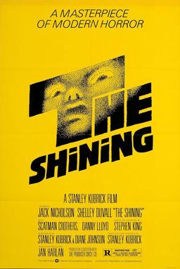
After working with Saul Bass on storyboards for Spartacus in 1960, Kubrick got back in touch with the designer some 20 years later to request Bass design a poster for Kubrick’s upcoming Stephen King novel adaptation, The Shining.
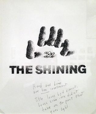
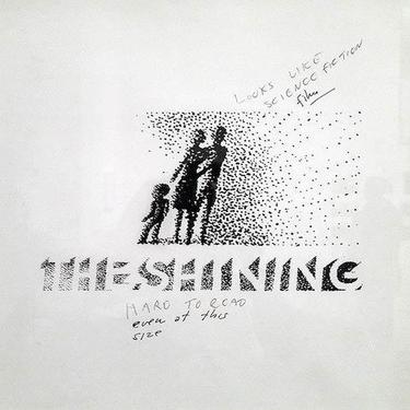
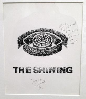
While the final result was the iconic, yellow one-sheet that appeared in theaters (at right), there were a number of iterations Kubrick rejected. Bass tried several approaches, drawing inspiration from different aspects of the film including the maze, the snow, and the family unit.
Some of the rejected poster designs feature handwritten notes by Kubrick including, “Hand and bike are too irrellevant (sic),” “Looks like a science fiction film” and “Maze too abstract…” It’s clear to see why the early attempts were rejected but it is also possible to see how Bass evolved to the final product. The approved result depicts an off-kilter terror with an in-your-face simplicity.
Want a little additional peek behind The Shining curtain? Check out this clip of footage shot by the director’s daughter Vivian Kubrick, during the filming of the movie.
Have a question or comment? Post it here or drop a line to sue@blackgate.com.
This is NOT Kubrick’s vision, but I find it brightens my day every time I see it, so hopefully it will shed some much needed light into that basement of yours. Sorry, no hotlinking so you’ll have to cut and past.
https://www.youtube.com/watch?v=Os6raCCmAFk
Art darling – Just goes to show the magic of editing and sound tracks, and why I so often end up sitting in crappy movies simply based on the trailers.
And trust me…you don’t want to see too clearly down here.
GC
Chick: I will now forever tag Solsbury Hill as ‘our song’ 🙂