Software Review: A look at Campaign Cartographer 3 Plus

When I snagged a pre-release review copy of Profantasy Campaign Cartographer 3 Plus, smugness quickly turned to irritation… then to understanding and respect.
Let me tell you about it.
Though just a 3-person company, Profantasy are the behemoths of Fantasy cartography.
They’ve been around since 1993 (so far back that I think Richard III was still on the throne) which says a lot. They have a massive suite of programs for designing things like dungeons, cities, star systems and starship.
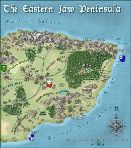
Their output is beautiful. Just glancing at what people can do with is enough to take you to otherwhen places .
So as I downloaded their not-inexpensive software, I was grinning happily to myself…. just like one of the dark lord’s minions walking into an ambush.
The new version is certainly an improvement on the old (which, however, did as advertised).
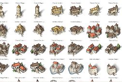
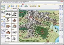
It’s more stable, makes full use of the power of modern PCs, has a prettier, less confusing interface, a really very useful “verbose” tooltip that pops up when you use any tool, and smoother navigation.
I had the power to create beauty. I was mesmerized!
Then the ambush sprung.

Like most writers, I am used to creating by iteration. I rough things out then refine them, tinkering with structure and detail until things are right. That’s how I write, and how I want to worldbuild.
Campaign Cartographer just doesn’t lend itself to this way of working. It’s just too granular, too fiddly. You select your tool first, then the thing you want to tweak, and even drag and drop entails menus and mouse clicks. This software felt like the graphics equivalent of a typewriter, or perhaps FrameMaker.
So, gentle reader, I became irritated.
But then I recalled my friend Andy Law who actually makes his living as a cartographer and I finally understood.
That granular fiddliness?

It’s a feature if you are designing a map, rather than building a world.
Whereas I’m thinking, “Rah mountains, rah dragon, rah road!”, professional cartographers are thinking, “Mountains must leave space for dragon and road, and mustn’t interfere with the text, and it has to look good”.
Me using Campaign Cartographer for my musings is like my mum using Scrivener for her shopping list.
And that understanding brought respect.
Cartography is like any other design skill. It takes talent, hard work and most of all practice. Cartographers no more dump symbols onto the screen than we writers just type the stuff in our heads then hit “Upload to Amazon”.

So, don’t buy this software for world building unless you are comfortable with professional CAD tools — I know some of you are.
However, do, consider buying Campaign Cartographer if you need to produce professional looking maps of your imaginary world, for example for a self-published role playing project or a Fantasy ebook.
If you are prepared to use this package as a intended, as a design rather than creativity tool, then you can quickly start to produce encouraging results; the learning curve is only a problem if you insist on skiing uphill! My own efforts after an hour of tinkering were not so bad, and would have been better had I been mapping a world that already existed in rough form.
Ultimately, Campaign Cartographer does require putting in some effort, but for map design, the results are rewarding and learning the software is not a bad way of spending a rainy Scottish afternoon.
UPDATE: When you buy CC3, you actually get CC3+ plus the old version which will be superseded when all the add-ons are also updated.
M Harold Page (www.mharoldpage.com) is a Scottish-based writer. He has several Historical Adventure books in print. His creative writing handbook, Storyteller Tools: Outline from vision to finished novel without losing the magic is available on Amazon. If you live near Edinburgh, Scotland, he would love to teach you how to fight Medieval German Longsword.
My brother bought cc, previous version and almost fell into the same “trap”. Agree, key is cc is aimed at granular small scale maps. World building starts to become onerous and chew up memory.
The solution is Fractal Mapper, also from pro fantasy. You can use this to generate world, and closer looks at continents and then switch to cc when you get within a scale you are comfortable with.
I’ve been a fan of the program since it first came out. While I’ve not used the CC+ version that recently came out (downloaded and looked at, but not used yet), I consider the program a very useful part of my DMing repertoire.
I just got the new version yesterday. Before that I was using CC3 off and on and had just started using it again. Yes, CC3+ is prettier, it has some better symbols and fill styles, it’s quicker and some bugs are plugged, but it still has all the major problems that CC3 had. The most glaring problem is that the code is terribly outdated, and I’m not talking about the unimportant update they actually addressed, the way it looks. Bigger, prettier icons does nothing to address the fact that the learning curve for this software is unecessarily high because the program and accompanying documentation haven’t received proper attention in years. Case in point, search the help for “borders” and you will come up with some instructions to click an icon which no longer exists. I don’t know how long it hasn’t been there, but it wasn’t in CC3 and it isn’t in CC3+. I also found a link in the help file which lead to a portion of the help file which no longer exists. This is why there are so many tutorials out there for this software; because the help hasn’t been updated in years, even though the program has changed a lot.
And the help file is not the only problem, either. There are no context-sensitive menus for pretty much anything. If you right-click on something it either does nothing or they’ve assigned some action for it chosen, essentially, at random. For instance, if you right-click a symbol, it maximizes the symbol selection window. Yes, it’s useful, but what, in my history with Windows applications, would ever make me think that would be the effect of right-clicking on something? Absolutely nothing. So how do I find out about this feature? By accident. I either try right-clicking on random things or I find the right tutorial. Or maybe I get lucky and that’s one of the things in the help that is actually still accurate.
Don’t get me wrong, it’s a beautiful program capable of amazing things. It really is the best software out there by a long shot. But I, personally, didn’t find anything all that amazing about a prettier interface or some new features when the old pains in my butt were still glaringly there. The software is still unnecessarily complicated by the lack of context-sensitive menus. Learning the software is still unnecessarily overdependent on the use of tech support, tutorials and trial and error because absolutely nothing about it is anything like literally any other Windows application. And even the things which should be straight forward and intuitive simply aren’t. Try to edit some text once you’ve placed it. You use one tool to edit everything and it works great…except the actual text of a label. For that you use a completely different tool buried in the menus which does nothing else. Want to see what fill style you’re using? Good luck. The edit tool will let you change it, but rather than being populated with what’s currently being used, it’s populated with the same defaults every time, regardless what you’re editing. I haven’t found the hidden tool yet which lets me see what current settings are. And God help you if you are looking at it one day and you realize that the 6 standard toolbars on the top, left and right actually only have enough icons to fill 3 of those toolbars with room to spare and you want to customize them to combine them together and get some more valuable screen space for your work, because you simply can’t. Not going to happen. There is no way whatsoever.
So, if you’re thinking about buying a new map making software, definitely go CC3+ (when it’s fully released). Be prepared to go through a ton of tutorials, though. If you have CC3 and you’re thinking about upgrading, maybe you should. If you have problems with the speed or want a prettier interface, go for it. But if you’re hoping for a fundamentally different experience; an easier, more refined interface, it’s just not there.