Arak Issue 3: Welcome the Iron Maiden!
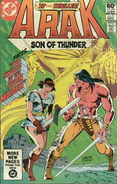
 Our adventures with Arak the Viking-Native-American continue!
Before I summarize issue 3, I haven’t said anything much about the artwork yet, so I’ll do my best to opine on that a bit. I don’t have a particularly deep background in visual art, other than that I’ve been looking at it all my life (and occasionally drawing a cartoon or illustration here and there), so I speak strictly as a layperson on this. That said, here are my general impressions.
First, the elephant in the room: To younger eyes that grew up on the computer-enhanced visuals of the past decade or so, these old pre-‘90s comics must look terribly quaint. Take a representative comic off the stand today. The colors and depth and lighting effects, the impression of characters leaping right out of the 2-dimensional bounds of the page from explosions that look like they could burn your fingers: such is to be seen in any typical issue of a mainstream comic like X-Factor (which is produced twice monthly!)
So, right off the bat, a typical early ‘80s comic like Arak appears, by comparison, pretty flat, the colors dim and washed-out, with a limited palette of hues and rather pedestrian panel lay-out with few or no “effects.” Older comics look much like their ancestral progenitor: the old newspaper comic-strip or “funnies” pages, because that is essentially what they were, printed with the same technology on the same type of thin pulp paper.
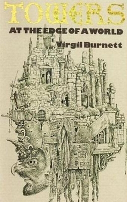 One of the distinct pleasures of book fairs and used book sales is finding an intriguing book you’ve never heard of. A greater and related pleasure comes when that book turns out to be quite good. Then, in reaction to that, there’s a melancholy that sets in from the fact that a worthwhile book is largely unknown. I’d like to think I can take the edge off that last sense by writing about some of these books here. So, given all that, a few words about Virgil Burnett’s Towers at the Edge of a World: