Art of the Genre: Concepts of a Fallen Vanguard

Now I’d had some limited experience with Vanguard back in about 2008. In a former life I took part in Sony’s Star Wars Galaxies circa 2003, and a friend of mine convinced me to come over to Vanguard and say hello many years later. Since it was only eight months after Vanguard’s release, I figured I’d oblige, so I went to a local Gamestop and asked the clerk where I could find the game. He actually laughed in my face.
Come to find out Vanguard had been a colossal bomb, so much so that you couldn’t even find a retail copy less than a year after it hit the shelves. In fact, Wikipedia lists Vanguard’s awards as: Gamespy awarded Vanguard the “Biggest Disappointment” award for 2007. Vanguard also won the awards in the categories for “Least Fun”, “Most Desolate” and “Lamest Launch” in the MMORPG.com MMOWTF Awards for the worst games of 2007
[Note: As bad as this game may or may not have been, there is absolutely no way it could have been a complete failure in every way like Final Fantasy XIV. That is hands down the worst MMORPG ever released on the mass market.]
Still, even after being thrown out of the store, I eventually I found a version and loaded it up. Thinking I’d meet up with my uber experienced friend, I purchased a full-blown max level character from a clearing house site and was ready to roll! What happened? I promptly fell off a pier in the city my avatar originated, drowned, and lost all my items….

I learned two things from this, that Vanguard was beautifully rendered, and certainly not the place for my inept mouse skills.
You will, however, notice in all the above criticism that nowhere is there a knock on the game’s art. I have to agree, and in the single afternoon I walked this world I found it a brilliant three dimensional representation of high fantasy.
Somewhere along the line the developers got it right, perhaps not in code or game play, but they knew how to make the world sing. I remember looking at the cover of this game and thinking to myself, ‘That’s a Parkinson, and that means excellence.’
Well, certainly in a way I was right because Keith did participate heavily in Vanguard’s artistic development, so much so that he recruited names like Den Beauvais, Jeff Easley, Tim Truman, and even Brom to help create the groundbreaking visual concepts for this world.
Every detail of this high fantasy dimension showcased the creative spirit of the artists involved, and as I sat down with Nick to talk about art I was reminded that maybe everything doesn’t always work out they way you’d hoped, but that doesn’t mean the journey wasn’t worth it.
Nick was gracious enough to pass along some concept work by the artists involved and I have the pleasure of releasing them here on the BG website.
You know, this is one of those gifts you get only occasionally in your life, especially in my case as I happen to be so passionate about the artists in question. I’ve followed this kind of RPG talent for nearly 30 years, and when you get a chance to see stuff that you didn’t even know exits, there’s a pretty big high involved.

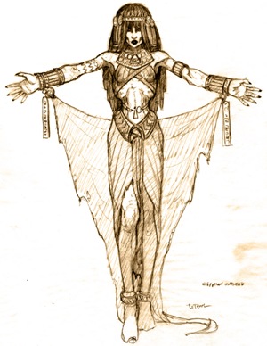
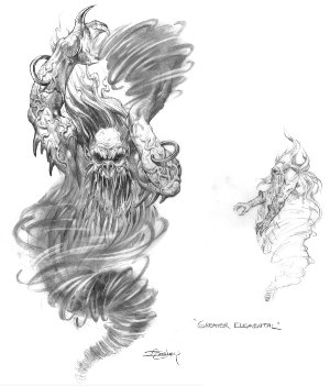
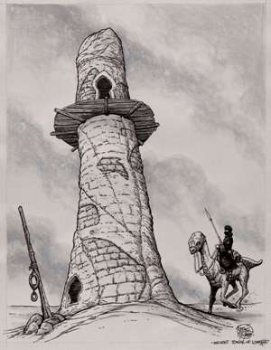
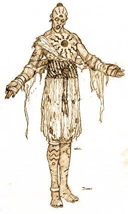
Today I’m going to feature three artists that were involved and some of the work they brought to the table. All the art is line work, one of my favorite styles to be honest, and perhaps through their skill you’ll be able to see what Vanguard might have been if given a bit more opportunity.
First I’ll roll out Timothy Truman’s work. Tim is a veteran of TSR’s early ‘pit’ and one of the top 5 black and white fantasy artists I’ve ever seen. Although now more a comic guy, his newest project called Hawken, he graced the pages of old Star Frontiers, classic modules like Isle of Dread, and dozens of other TSR mainstays from the mid 80s.
As I looked over his concepts, I couldn’t help but be transported to another time, some of them ringing so true to his early work in the genre that I thought I might have picked up an 80s issue of Dragon Magazine.
Tim’s pencils certainly haven’t diminished over time, and a good deal of his work on Vanguard was the concept construction of buildings. He did a fantastic job showing us what the desert continents of the world would be, and the race of cat-like player characters known as the Kurashasa.
After Tim’s pages, I took a look at work by Jeff Easley. Now any of you who’ve read my blog over the years understand I’m pretty close with Jeff and that I think his work helped define the youth of an entire generation of gamers. That being said, his work on Vanguard is certainly some of the strongest he produced post 1995, and I might attribute some of that to a resurgence of nostalgia at getting to work with people he’d grown up around in his early days at TSR.

Jeff also helped quantify the desert, his elementals and beasts bringing danger to the place. He was tasked with creating the enemy in the desert, a project that lent extremely well to his ability at creating the creepy.
Here, Easley brings us his slope-shouldered nomads, great serpents, and a wonderful rendition of a kind of insectoid menace. Still, my favorite of all these is the kind of Sarlacc bug, the digger in the sands. Here Jeff shows a keen eye and excellent pen as he makes a creature I’d have sure to been killed by had I stayed in the game any longer.
Last we get a glimpse of another one of my favorites… Brom. Funny, but guess what they gave Brom to work with? Yep, the dead! I mean seriously, talk about being typecast, but dang he does it well.
Tune this puppy up both the creep and beauty factor to a full on ten and then have a go, because Brom brings some awesome pencils to this project. You know, I’d never really seen Brom roughs until these were passed along to me, but the more I looked at them the more I had to respect the man’s talent on all levels of design.
So, I hope you’ve enjoyed this little remembrance of a game that was, but really never was, and the kind of art that inspired it. Whatever the case, the game gets an A for its art, and even today it still stands the test of time against many of its contemporaries where graphics are concerned. Again, spend your budget wisely, but all phases of the game count equally, and even great art can’t save a flawed design.
Very nice, Scott! I’ve never played VANGUARD, but after seeing these art concepts — especially that Tim Truman tower! — I wish I’d given it a chance.
Looking forward to seeing what Denis Beauvais contributed. I’ve lost track of him in the last decade or so. He was one of the folks I always wanted to recruit for a Black Gate cover…
Gads John, you know we don’t have the budget for Den 😉
Thanks for the fantasy art find, Scott!
EE: You are more than welcome! 🙂
Interesting post.
John, it looks like Vanguard is actually alive and well and is now well regarded. Apparently it made up for its shortcomings with a series of bug fixes and is doing okay these days.
Scott,
> Gads John, you know we don’t have the budget for Den
Too true, sadly!
Howard,
> it looks like Vanguard is actually alive and well and is now well regarded. Apparently it
> made up for its shortcomings with a series of bug fixes and is doing okay these days.
Ah, the magic of bug fixes!
Glad to hear it’s still alive. I’ll have to give it a try!
I love game art and these images are an example of why. The sad part is that the game trailers are always so much more exciting than the games.
I would agree Ndoro, at least in a sense. Truly, any game is only as good as the imagination you put into it yourself and not the overall design. If you believe you’re there, and tell yourself a story as you travel, it’s amazing how much more fun a game becomes.
[…] Black Gate (Scott Taylor) on Art of the Genre: Concepts of a Fallen Vanguard. […]