Art of the Genre: Eowyn, Nouveau, and Herman Lau
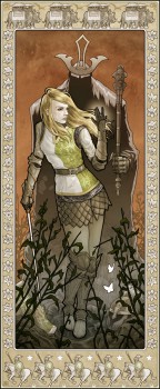
Eowyn… a fantasy lover’s dream… When I first read Tolkien, I fell in love with her, and really what boy wouldn’t? I’m pretty sure I was in love with her even before I read Lord of the Rings, having watched the Rankin and Bass Return of the King where the Pelennor Fields is laid out in all its animated glory.
Pelennor Fields gets me every time, my adoration of Theoden and his fear that he will never be good enough to sit at the table with his ancestors a strong enough subplot to carry the battle into my top five literary moments. Theoden, however, pales in comparison to Eowyn’s battle with the Lich King, and this cements her as a heroine for the ages.
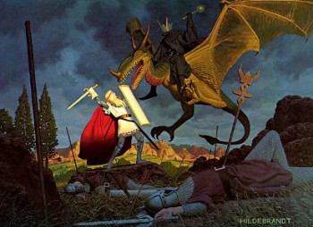
Her conflict and resolution have been the subject of countless artist’s visions, and you’ll not find a Tolkien calendar, omnibus, reference, etc without this scene portrayed in it. Somehow, Eowyn has transcended the pages, surpassed Frodo and the ring, eclipsed Aragorn and the shards of Narsil, and overshadowed Gandalf and the Balrog while talking hold of Tolkien’s world as the image to both render and remember.
I, like all of you, have seen countless renditions of this conflict, but it wasn’t until earlier this year that I had a new take on the subject material capture my imagination. Before I detail this, let me first set the stage.
I’m a pretty big fan of The Art Order, a site run by Wizards of the Coast Creative Director Jon Schindehette. He does some great stuff over there, and I have to say that some of my favorite topics deal with contests, or should I say ‘challenges’.
One of this year’s artistic competitions revolved around Eowyn and the Nazgul, each artist tasked with the following line, ‘There’s nothing complicated about this challenge – review the scene in the book, and create your own interpretation of the scene…’ The requirements didn’t end there, and if you continued to scroll down you discovered what I perceived as the most interesting aspect of the challenge, the judging, which read as follows, ‘As always quality is a major player in the judging as well as fulfilling the art order, but this time you are also going to be judged on the innovation of your interpretation, and the storytelling of the piece.’
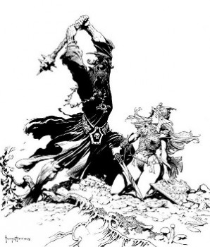
Ok, so Jon lays it out, and over the course of a few weeks a fantastic set of images come rolling in concerning Eowyn. To be sure, there are all kinds of takes on that scene, most traditional, and some going so far as to create comic pages, but in their essence each stays true to the fundamentals of one-dimensional storytelling. What you read is what you get, and I’m down with that because the words themselves are so strong. I mean, why go out and fix something that ain’t broke, right?
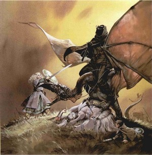
That being said, I will refer you back to Jon’s quote on judging where he states, ‘the innovation of your interpretation, and the storytelling of the piece.’ To me, that was the crux of the challenge. This image has been done SO many times it’s almost found its way into fantasy cliché territory. I mean really, how can anyone overcome artistic renditions with names like Frazetta, Hildebrandt, McBride, Kaluta, etc? Well, the answer should be ‘you can’t’, not if you use the source material as written by Tolkien. The contest concept itself reminds me of an old joke. Two men are in the woods and a hungry bear comes out of the trees. One man drops to the ground, takes a pair of running shoes out of his backpack and starts putting them on. The other man looks at him and says ‘are you crazy, you can’t outrun a hungry bear!’ to which the guy with the shoes replies, ‘I know, but I only have to outrun you’.
The artists in question were in it to ‘outrun’ each other, and this is why Jon’s challenge was so ingenious. Yet when the final submissions were in and judging began to show the winners I was disheartened by the results. Not because the winners were anything but beautiful, but because I felt the judges failed to take the challenge’s parameters to heart. Jon, for all his talent and foresight, failed to ask me to judge this contest, but if he had I promise you I would have made some noise about one artist in particular, that being Herman Lau.
In my opinion, Herman Lau ‘got it’, and for the first time in recent memory I was not only surprised by art, I was inspired by its interpretation of a well known subject matter. To fully understand what I’m talking about, I’m going to take you through my job as an Art Director when I go over a single piece of art.
First, it has to meet basic requirements of beauty, the artist’s evident ability, and a moment of ‘pop’ that makes me want to delve further into the image. If any image has these, then I will take the time to go deeper, and that journey is really what my job is about.
Herman’s vision met the above criteria, and as I sat down to take a longer look, I stumbled upon a process of deconstruction so intense that I had to employ Google, the blow-up feature on my image reader, and several sessions of layer peeling for which I needed to walk away and come back with fresh eyes.
So, let’s do this Art Director thing…
Medium: Initial pencil sketch scanned into computer and then finished digitally. It’s a common enough practice, one Matt Wilson likes to describe of as ‘lazy’, but only because he was feeling lazy when he first started doing it in the late 90s. Today, it’s pretty standard stuff, and it gives the image a pristine quality that is hit or miss depending on the tastes of the viewer.
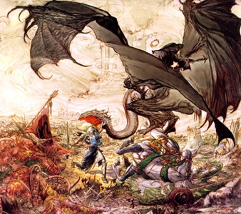
Image construction: Herman employs the only two characters truly required by the challenge’s description, Eowyn in the foreground, the Lich King behind. However, his image is filled with outside influences that take on a kind of tertiary character to the two protagonists. Here is where he evokes a greater degree of Art Nouveau, but instead of utilizing artistic line flow he frames the piece in a full story.
Eowyn: Much can be said of Eowyn, namely that almost all images off her are not true to the description provided by Tolkien, that being she’s never really depicted wearing men’s armor. It is fantasy after all, and she’s a fantastic heroine, so artistically it’s better served to ‘pretty’ her up a bit. I don’t take issue with this, especially if you’ve decided to do your picture using Art Nouveau, a venue primarily focused on selling a product using lovely women. This Eowyn does just that, selling the piece with a twisting female form. We see her knees bent in, and feet pointed slightly together, a common image in playful advertising for geared at men. This submissive pose is juxtaposed by her armor that reveals not a bit of flesh for a now intrigued eye. She becomes what most artists look for in this scene, a figure both sexual and proud.
Lich King: He dominates the image from a position that should be secondary but instead becomes an overwhelming focus. As a wraith, he has no form, and yet even in his ethereal essence he shows strength. There are no eyes, no face, and yet we see him staring back at us, his height with crown and breadth with cloak create something bigger than life, and that is what the Lich King is all about, greatness beyond the reach of the mortal coil.
Conflict: Ok, so here is the seed of the challenge, depict the classic scene of conflict between Eowyn and Nazgul. Instead of swinging blades and severed fell beast heads, Herman chooses to manifest a more destined conflict of ego and fate. Again, a perfect use of Nouveau here, the entire image becoming a kind of theatrical poster meant to sell the scene. It’s sex, domination, power, pride, sadness, beauty, frailty, conviction, and heart all wrapped into one. Eowyn is fragile, turned away, with tear-stained cheek of heavy loss. Her world is shattered, and yet she still persists, broken arm raised and sword still in hand. She is at the cross-roads of destiny, turned away from her fate in one last moment of contemplation, and yet her upturned hand gives a glow of intent, of possibility, of magic inside that shines against the enveloping darkness of the Nazgul’s nothingness behind her.
The Lich King is power, darkness, and murder with his leering mace, and yet the absence of true substance is undone by the glow of his prey. He reaches forth with a hand from the shadow, fingers outstretched to claim another victim and yet he is stayed in the attempt. The placement of these grey fingertips in the middle left of the image is also a subtle alluding to the coupling of these two powerful figures. This hand does not grab at a shoulder or wrist, but instead moves to Eowyn’s hip, the place a lover rests his hand in a moment of shared devotion. He seeks her, needs her, the moment echoing the fatal draw of a moth to flame. His presence has gone so far as to slither beneath her feet, the evil of his dark cloaks representing the destiny she cannot escape. She must face him, but that final turn into the dominion of his hate has yet to be fully evoked.
Story: Aside from the power of our two protagonists, the Battle of the Pelennor Fields is portrayed all around this image. The frame is pure brilliance, as below the image we find the charging cavalry of Rohan set with a balance of stars and trees for the livery of Gondor. Above, lumbering Oliphants of the Haradrim are punctuated by the flying fell beasts and cornered with the Eye of Mordor. Along the edging we see Eucharist lilies or ‘maiden charms’ that speak to the power of our mythical heroine.
Inside the border is the field, ragged and broken stalks of grass provide place, while her cloven shield is to the left of the frame and the noble helm of her uncle lies to the right. We are bathed in battle, the amber sky a pure color of conflict and old blood. We are also reminded of family and hope, the white moths symbolizing the departure of the cherished souls of Theoden and Snowmane.
My final thoughts concern the moment of action, of decision, of finality. Here, we are ‘in it’, seeing the very moment of resolution. Eowyn knows what she must do, it’s in her eyes. She will not give in, not bow, and not depart with her loved ones. Herman hits a home run here, and once I saw his rendition I was convinced that not only would he place, but he’d win the challenge all together. I guess it goes to show what I know…
Herman and Eowyn didn’t even find a mention in the final winners, and as a matter of fact, this picture didn’t even get a single vote! I guess that’s just life, but you know what, it never set well with me so I went out and found Herman and asked if he minded me talking about his Eowyn piece. Lucky for all the art fans here he said yes, and so Herman might not have won The Art Order challenge, but he placed 1st with us here at Black Gate, so congratulations!
I’d like to say thank you for creating this inspirational piece, and if any of you are interested in more of Herman’s work, you can find it here.
[…] http://www.blackgate.com/2011/09/07/art-of-the-genre-eowyn-nouveau-and-herman-lau/ Like this:LikeBe the first to like this post. from → Art ← Enter: Megavolt No comments yet […]