Art of the Genre: The Black Company
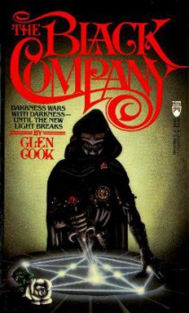
In 1984 author Glen Cook published The Black Company. In 1990, my freshman year in college, this book was passed to me by a person on my dorm and I spent the next decade following the exploits of the last of the Free Companies of Khatovar.
Now, as a storyteller myself, the book resonated with its rather unique concept, that it was actually a tale written by the Company annalist as he continued the four hundred years of written tradition the company had laid down since its came out of the distant south.
This is a military book, although cast in a fantasy setting. To that point, there are wizards present, although all of them are seemingly either competent illusionists or powerful necromancers. You don’t see any fireballs or lightning bolts, and the craft of a medieval military is kept up in rather precise fashion as the Black Company moves from what I would perceive as northern Europe, through Africa, and finally ending up someplace in India.
It’s a fantastic tale, one so well crafted that I’m actually floored even today when I remember a three-book long twist that had me shaking my head and calling for Cook to be given a Hugo. If you haven’t read the series, I certainly suggest it, even if the first book is over twenty-five years old and what was acceptable for publication then is much different than today. I still think these books hold water and are well worth your time, but on to the reason I assume you’re here, the art.
Anytime you produce a series that spans fifteen years of real time and ten volumes there are going to be changes in art direction, and The Black Company is no different.
There is an interesting tale concerning the first few volumes and cover artist Keith Berdark. So the story goes, a quoted from an interview with Cook in Quantum Muse:
“The cover of The Black Company was a cover somebody made up for me. It was just an example. The marketing guy absolutely didn’t want it. But, while it was on his desk, a buyer from a large chain bookstore came in and, not knowing anything about the book, said ‘I’ll buy fifty thousand copies of anything with that on the cover,’ so they went with it.”
This is one of those extremely odd circumstances that happen to work out for everyone involved. It’s really called ‘spec work’, as in the artist is speculating that work done for free will come to cash once a piece happens to get out in the world. I’d say this actually works about one percent of the time, but in the case of Keith, he ended up getting a multi-book deal for artwork that in my opinion ended up being out of place in a rather gritty and hard-core series. 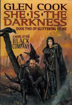
The initial cover, however, was an interesting piece, and one that intrigued enough readers to join in that Cook’s work got out to the mainstream. It was, however, by far his best work on the series.
Berdark has a rudimentary edge to his work, something less than classically schooled which might not be such a bad thing [it worked for Erol Otus and Jim Holloway after all]. For some reason when I look at those early covers I’m reminded of a few oddball Dungeon Crawl Classic modules. They’re smooth edged, almost pliable, and give a sense of unreality that eventually grows on a person as the series wears on.
The Berdark tradition continued until Cook released his first hardcover in 1999, She is the Darkness. The art divergence here brought in the truly life-like art of Nicholas Jainschigg. I was both aghast and intrigued by those characters represented on the cover, but as I’ve aged through my 30s I think this is perhaps my favorite representation to date. The cover finds a heavyset and balding Croaker seated next to a war-lathered Lady, both of them looking worse for wear. It might not be ready for a Parisian runway in supple couture and surely wouldn’t win over the fanboys at a comic convention, but Jainschigg’s work represents all the hardship, loss, and age that forty years of hard military campaigns take on a soldier’s body, even one as immortal as Lady. Seriously, we don’t all turn into Harry Hamlin or Tom Cruise, the better part of the male populace sliding into the gentle decline no matter how hard we fight it. 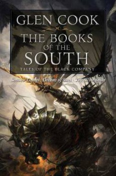
By the time all the volumes in the three series [Books of the North, Books of the South, and Books of the Glittering Stone] were completed, publishers were looking to combine them into single volumes to promote later sales.
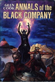
To this task, Nelson Doubleday released all three of the Books of the North in a volume titled The Annals of the Black Company. This book was painted by Tom Kidd who is a considerable step up in a more traditional sense, much of his work reminiscent of a cleaner Darrell K. Sweet.
This in turn was followed by a second volume in The Black Company Goes South, with the Spanish artist Koveck doing the work. I can’t say what sales were for these two hardcover volumes, but there was no third one completed, and the Black Company went untouched for several years until Tor did mass reprints in volume sets of all three series.
These volumes, titled The Chronicles of the Black Company, The Many Deaths of the Black Company, The Books of the South, and The Return of the Black Company were all splendidly rendered by former Magic the Gathering artist Raymond Swanland.
Swanland breaks the mold here, and his hard-edge style breathed new life into a venerable series. This again proves the power of cover art, and Tor being the pinnacle of fantasy, did the series right and was rewarded for it. 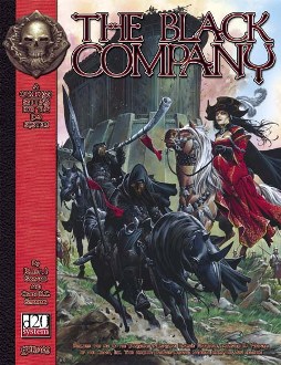
These covers broke out a renewed buzz for the Black Company, and I’ve seen them featured with a vast amount of other Swanland covered Cook fiction in the trade paperback section at B&N. Swanland’s art is almost haunting as it’s display and you are captured by the darkness in it, and almost palpable misery seeping from the bladed edges of each piece.
I would also be remiss to my RPG readers if I didn’t mention that Green Ronin publishing did a D20 RPG on the Black Company in 2004 with an outstanding Wayne Reynolds cover. This particular game, which retailed for a whopping $44.95, does a fantastic job of capturing the rather unique universe of Cook’s Company. A retooled magic system and some of the best RPG based war rules are included within, but again, the cover draws you to the book.
Green Ronin, like Tor, Wizards of the Coast, and Paizo, hitched their wagon to Reynold’s rising star, and his representation doesn’t disappoint. In fact, I believe his image is the only one to actually relate a full defensive bastion that the Company is so often forced to conquer. Lady, for her part, is dressed in regal red and riding side-saddle which I think adds volumes to any cover when war is being portrayed.
Nonetheless, fine work all around for a series well worth the time commitment. If you have a chance, I’d say pick up one of the new Tor editions and enjoy the ride.
One of the very few old school series I have NOT read. I’ll need to remedy that sad fact soon, as so many recomend it.
Genghis,
Well, the series it old for sure, but I think it holds up well against other books of its time. I hope you enjoy!
This is one of the best fantasy series ever. Croaker the Keeper of the Annals and closest thing they have as a medic is a fantastic point of view, sympathetic but so prosaic, even poetic when needed. Well-crafted tales with dynamic characters in one of the darkest of dark fantasies blend subtle magic with bold military maneuvers and a gritty sort of “Sgt. Rock” realism that feels like Tolkien does Viet Nam.
I began these almost twenty-five years ago and there are scenes that still burn brightly in my mind. The first cycle “The Book of the North” has been my favorite gift to friends and I still own multiple copies of the books.
I own a cherished copy of the RPG. I guess I am the choir.
The second cycle “Book of the South” was a bit denser, but well worth the read.
For many years “There are strangers on the Plain, Croaker” was my gaming group’s mantra for weird stuff happening.
Mackleby: Well said, and I’m glad I’m not the only one to thinks these books are pure gold.
‘There are strangers on the Plain, Croaker’… CLASSIC! 😉
Why did they draw Doctor Doom on the cover of that first book?
PB: Who knows, but it got a huge advance, so I guess comic fans liked it 😉
The first book blew me away, and I enjoyed the rest of the trilogy plus The Silver Spike. I read the first two Books of the South and quit the series.
If a weak-willed, weak-bodied character is introduced early on, you know he’ll be a stone-cold killer by the end. Cook handles that transformation well.
I think this is sword and sorcery from the 80s more or less like the works of David Gemmell, isn’t it? No high fantasy here
the series are published in Spain, but aren’t a big success, even a s/f and fantasy collector I know thinks they are young adults fantasy…
this series of art of the genre is very good but I prefer the articles on covers of books than the other about rpg, ehem, in fact I haven’t read them, but as I say that articles on books are more interesting for me
greetings from Spain
by the way in the XIII century the catalan company, from Catalonia in the northeast of Spain were hired by the bizantines to fight against the turk invaders and in a very howardian turn of events they were betrayed later causing the remains of the company devastating Greece and even creating a mercenary ruled kingdom in Athenas, the duchy of Neopatria
Jeff: You know, I never read The Silver Spike. I own it, but I just blew past it because it was an ‘aside’ and I never got back there.
Indeed, I love the development of weak characters who somehow survive and then become cool [I won’t say tough, because these books are anything but making characters killing machines, or as I guess I’d call it ‘leveling up’ in gaming terms] 😉
Francisco: Well met! Nice to see someone from Spain stopping in and having a read. Now if only I could get Luis Royo to come here my life would be complete 😉
Well, I’m trying to make Art of the Genre about all Fantasy art, but I must admit, gaming articles are my favorites, so you’ll have to skip some more along the way 🙂
Loved the story of the ancient merc company, thanks for sharing it!