Cover to Cover
 |
 |
 |
Until relatively recently, I never looked at cover art. I bought books because of a review, or, more likely, because of a personal recommendation. There was art I liked, and some I didn’t like, and some that embarrassed me for one reason or another. But, the art in and of itself didn’t influence my purchasing of any book.
It was recently brought to my attention, however, that the style of cover art comes in and out of fashion, like anything else. Many of us can tell, just looking at the clothing in a photograph, in what decade the photo was taken. Hairstyle is a great indicator, as are necklines, width and length of collars and cuffs, of hemlines and sleeves. Shoulder pads anyone? Thirty years from now, someone looking at today’s photos are going to think of the 2010’s as “the decade of the beard.”
There are many people better qualified than I to talk about cover art as art. I just want to talk about it as covers. My examples are completely arbitrary, and usually come from my own shelves. Keep in mind that in order to look at changing fashion in covers over decades, I have to look at works that have been in print for that long.
I’m not going to talk about individual artists. There are people much better qualified than I to discuss Frank Kelly Freas, or Chesley Bonestell, or John Picacio, or Todd Lockwood. I’m talking strictly fashion statement.
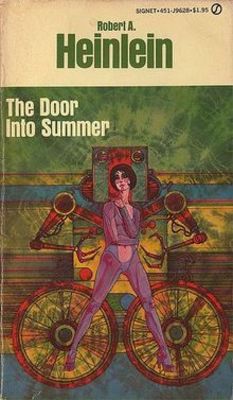
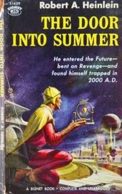
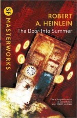
This week I’m looking at some SF covers, I’ll save Fantasy for next time. I can’t think of a better place to begin than Heinlein, so let’s have a look at the covers for Door into Summer above. You wouldn’t have much trouble guessing the approximate time period of this art. The first one is fairly obviously rooted in the psychedelic art of the 1960’s and early 1970’s, where colour and shape were the important features. The second is what I call guy-with-object-in-action-pose. You can see this in early Barbara Hambly or Randall Garret covers as well. A recent variation of this is man-in-cloak-with-weapon – less cartoonish, but basically the same. The final example is the most recent I could find, 2014. You see a complete shift from either one of the previous covers. This one is far more emblem-based, less person-based, and while colorful, unmistakably not from the ’60’s. Does anyone besides me see a Tardis in this image?
Of course, you can’t look at Heinlein without casting an eye on Isaac Asimov. The two covers from Caves of Steel are probably the best illustration (no pun intended) of what I’m talking about.
 |
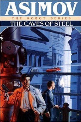 |
The first is very obviously a 1950’s product, an almost abstract drawing. The second is the action pose we saw with Heinlein. I’ve included the images of The Gods Themselves because the first one introduces what I think of as the “new wave” covers. There’s something some a little art nouveau, something a little Alphonse Mucha about it. The second, is the far more up-to-date emblematic image – and very photographic to boot.
Naturally, some of the best examples of new wave covers are found on books by new wave writers, someone like Roger Zelazny. It’s sometimes a bit difficult to be absolutely sure whether Zelazny is writing SF per se, or more of a science fantasy thing, but I think the following two examples fit the SF genre to some extent.
Jack of Shadows is one of my favorite Zelazny novels (I once went to a Hallowe’en party as Jack), so I was happy to see some good covers.
 |
 |
The first is obviously the earliest, and I think has the most new wave feel. This drawn cover isn’t in fashion any more, however, but the more recent cover echoes it, managing to update it without destroying the flavour of the either the earlier cover, or the book itself.
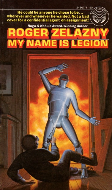
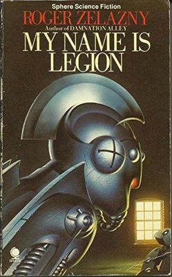
My Name is Legion is slightly more SF than Jack – after all, there’s space exploration and robots, which the cover art tends to emphasize.
 |
 |
 |
The first cover is pretty clearly the earliest of the examples I could find. Not only do we have the action/cartoon element, but we also have the technology-dangerous element, which is downplayed in later covers. The second one, for example, seems to be all about the robot, and not so much killing. I include the cover from Tor’s edition of Home is the Hangman, as what I think is the most recent cover. Rather more man-in-cloak than the first two, you can’t even tell whether the character shown is a robot. I also find it significant that both Legion collections both choose the Hangman story for their cover illustrations.
Of the covers I’ve got here, I’d have to say that two Jack of Shadows are my favourites. Next time I’ll be looking at fantasy covers, and we’ll see how they hold up.
And I’m not the only one looking at covers this week, check out Steve Case’s post on Diana Wynn Jones’ Howl’s Moving Castle.
Violette Malan is the author of the Dhulyn and Parno series of sword and sorcery adventures (now available in omnibus editions), as well as the Mirror Lands series of primary world fantasies. As VM Escalada, she writes the upcoming Faraman Prophecy series. Find her on Facebook and follow her on Twitter @VioletteMalan.
I used to buy everything SF & F and Horror I found, even if I ended up getting duplicate copies of something over the years that differed only in its covers. DAW was good at republishing stuff and changing covers, but I was a completist, and flush with cash (read: single), and didn’t mind helping support the writers and publishers of my favorite genres. That meant I also ended up with lots of crap (at least according to Ted Sturgeon), and sometimes multiple copies of crap, but I was happy, content, and up to my ears in stuff I couldn’t find the time to read. Not so these days, when there’s so much new stuff being published (electronically and otherwise), and when I’m much less economically free to do so. I also must admit: all too often, the cover turned out to be the best thing about more of my purchases than I’d care to confess. Still: even the promise of some of those artistic endeavors fueled the impulse to go ahead and buy the thing anyway, despite the fact I strongly suspected what was between the covers didn’t merit the ink and paper wasted on it. All the same, I have very fond memories of hours of time spent perusing my collection, avoiding homework (or grading my students’ papers) in anticipation of the day I’d get to open that book or magazine and experience the wonder and delight promised by a Kelly Freas or a Jack Gaughan or an Ed Emshwiller. Too often, those stories were indeed a disappointment, but I gotta tell ya: those old Ace Doubles and Analog covers still look mighty good on the outside when I take ’em down off the shelf.
I of course buy by content, but the cover is crucial element in my ‘book as object’ fetish. A wonderful book with a wonderful cover is thing of joy to be treasured and rolled around on like cat nip. For me anyways. I paint book covers and always try to make them a thing of beauty, or what’s the point ? That does leave me with the dilemma of book I’m some what interested having a hideous cover. I view that as a reflection on me and my taste and in the long run may not buy it. When I worked as a bookseller years there covers that I couldn’t believe people purchased 😉
This gets tricky when you’re trying to commission cover art. You want what you’re putting on your book to feel relevant to whatever else is going on on book covers, but you want your book to stand out, too. I ended up deliberately going so far retro that the artist’s style harkened back to before the existence of genre fantasy as a market category, but with a composition that felt vaguely like Michael Whelan’s. Online, the book may not be selling wildly, but when I bring it out in person at conventions the cover’s like a magnet.
To smitty59: I know that I’ve hung onto books I knew I would never re-read because I loved the covers so much. I also have a friend who has framed some of his favourite Ace covers, as well as some Amazings. I must ask him which ones he still has.
To Barsoomia: it really is wonderful when all the planets align and a great book matches its cover. I’ve been tempted at times to cover up the art with some plain paper, so I wouldn’t get looked at on the subway, but I don’t think I ever actually did it – though friends of mine have.
My brother is a bookseller, and was a lot of help recently with the cover of my own upcoming novel.
To Sarah: This is exactly how I got started thinking about this topic, because of some heavy discussions concerning the cover for my upcoming book. It’s hard to make your book stand out if there are a dozen or so on the shelf with the “man in cloak with sword” cover – and there was a period of time there when that was pretty much what you saw. I like the idea of going retro.
It’s also interesting to hear of your experience with e-book versus hard copy. I wonder if this means we should be looking at having two styles of cover, one for e-book purchases and one for hard copy perchases.
I don’t think the online problem is with the cover, so much as the sheer amount of other stuff available. And the stuff that seems to do best as ebooks is category romance, which isn’t what I do.
To Sarah: that explains everything; category romance outsells every other genre. I don’t know whether it’s true, but I was once told that it outsells everything other genre, combined.
The breakdown I usually hear from industry people for fiction for adult readers is: 50% Romance, 20%Science Fiction/Fantasy/Horror, 20% Mystery/Crime/Thriller, 10% Literary Fiction. Non-fiction is a whole other world. Poetry and drama are such small potatoes as not to be worth mentioning, at least as far as sales numbers are concerned.
[…] Sure Whatever (Black Gate) Cover to Cover — “Until relatively recently, I never looked at cover […]