Art of the Genre: I.C.E.’s Middle-Earth Roleplaying Part Three: The Black and Whites
 I’m not going to stand on a soapbox here and tell you my views on Peter Jackson’s The Hobbit, that released this past Christmas; but having seen it, I was prompted to once again take out my old Middle-Earth Role-Playing books and relive what I believe to be the prettiest RPG ever created.
Now I’m not saying that New Zealand isn’t gorgeous, but there is a big part of me that believes literature should stay more firmly based in fantasy, thus real actors and real sets somehow diminish the very nature of the words and images that helped define them in the first place.
In the case of The Hobbit, computers, no matter how sophisticated, couldn’t rekindle the joy I feel from the images I’ve seen painted and drawn concerning Tolkien’s world throughout my youth.
And speaking of youth, I’m constantly reminded that I’m from a quickly aging generation that now seems incredibly antiquated in the world. Technology is moving so fast, it sometimes makes my head spin to think that I grew up without cable television, cell phones, computers, the Internet, microwave ovens, and a plethora of other standard issue American items in today’s world.
I’d like to say that color was something that was always present in my favorite pastime, gaming, but again that would be fooling myself. It wasn’t really until the turn of the millennia that interior color pages were standard issue in gaming. I well remember, back in the late 1980s, how revolutionary FASA was for bringing out color interior images for games like Battletech and Shadowrun, the latter of which actually used glossy pages now found standard on all gaming material.
 Still, the trend didn’t catch on until the D20 boom and the proliferation of digital art that made rendering images in color just as inexpensive to commission as black and white pieces.
But I digress, my real point here is that at one time, black and white illustration was ALL one could find inside gaming books, and that meant that artists had to hone their skills with ink and pencil more than we see today.
Of these black and white illustrators, some of the more refined individuals to ever grace the pages of any RPG could be found in I.C.E.’s Middle-Earth Role-Playing, or MERP. Today, I will show you a bit of the art that most captured my imagination from three seminal interior artists for the game. So without further adieu, away we go to Tolkien’s Middle-Earth, sans the addition of a rabbit-drawn sleigh.
PART THREE
When one looks inside the pages of any, and I mean ANY, MERP supplement from the 1980s, you are going to find a Liz Danforth illustration inside. Liz started defining black and white art (and still does so today) with Tunnels & Trolls, but it wasn’t until the regality of MERP aroused that her true character shown through.
To quote myself, because I’ve already said it too well,
I find her lines both regal and refined. She captures beauty in a distinct light, her characters revolving around a true sense of chivalry and almost Arthurian purpose. She creates trimmed beards, flowing gowns, and steady brows. She presents a serious demeanor that becomes infused in her characters, each portraying a look of carrying the weight of the world on their broad shoulders.
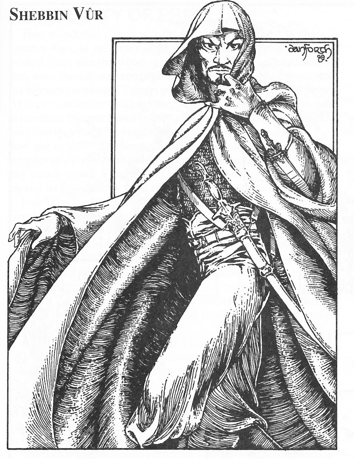
The nobility in each piece suggests more than role-playing as she blends the truism of real history with her creations. Perhaps you could call Liz the first ‘realist’, but the absolute facts lean more toward a creative spirit born from an education reveling in the tales of the past.
She once confided in me that she learned to read from Tolkien at her mother’s knee at the age of five, and I think that echoes in her imagery. Such an experience has provided her art with an unmistakable flare, and the touch of her guiding hand helped define genres such as Middle-Earth.
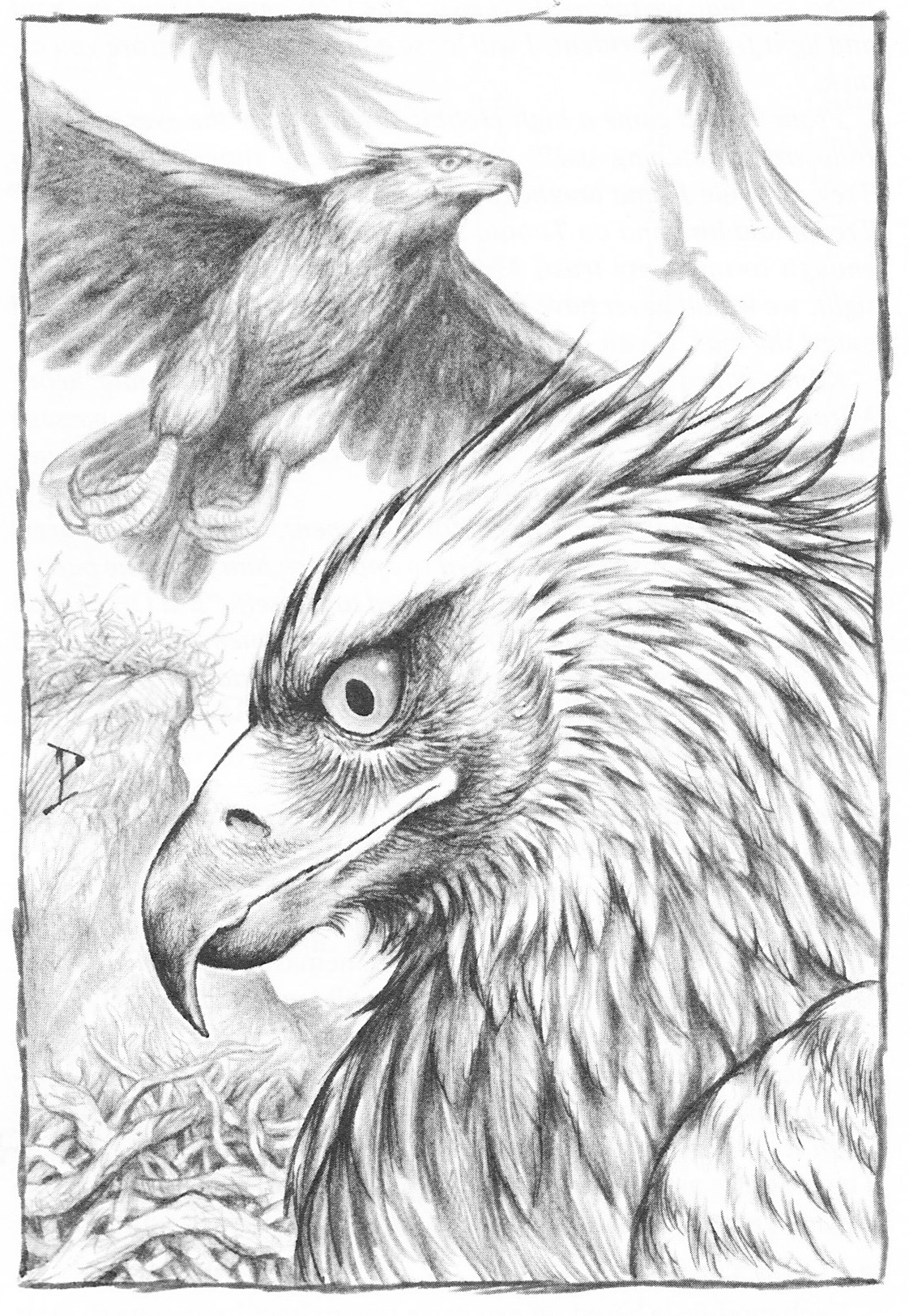
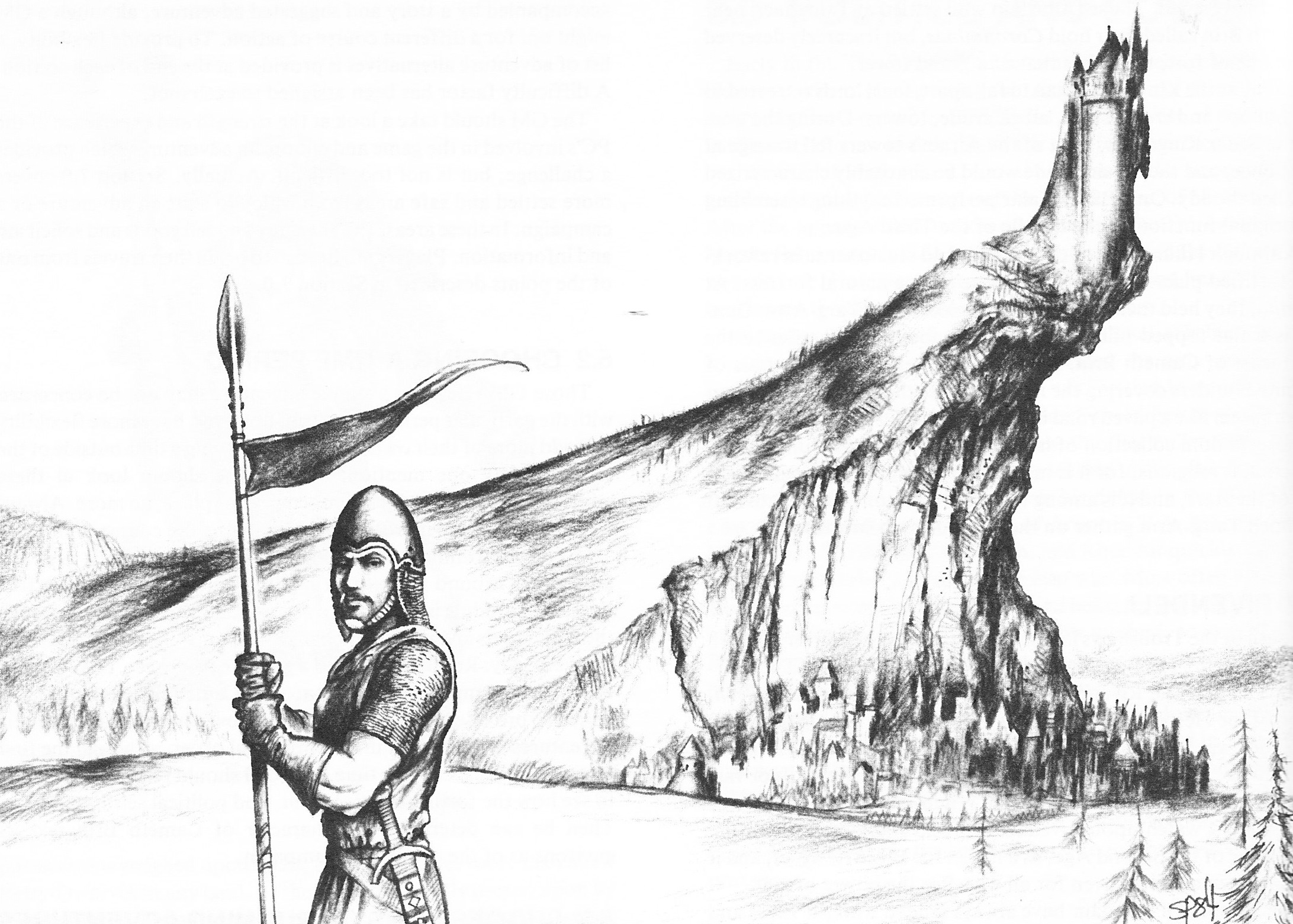
While Liz was taking on the world with characters drawn from the literature, artist Stephan Peregrine was doing the same by recreating the geography in exquisite ink-wash. Painting with ink is no easy skill, yet Stephan makes it look effortless with his brush, the world becoming so rich and tactile that you soon forget what you’re looking at is even black and white.
Peregrine is an absolute ink master, and if you ever get a chance to see his full interior work for Hillmen of the Trollshaws, don’t miss out because it will leave you shaking your head in quiet wonder.
He contributed to dozens of MERP supplements throughout the 1980s, but most of these were found prior to 1985 when his work began to dwindle and his love for the genre failed. Today, little is known of Stephan other than he withdrew from the society, and as the world was getting smaller he wasn’t part of that puzzle.
 When I spoke about to him to Rick Britton, former Art Director of I.C.E., he told a tale of Stephan having become disillusioned with fantasy art, like so many great artists have over the years, and the last time I saw anything of his was in an estate sale from several years back where some non-MERP illustrations had been sold from a private collection.
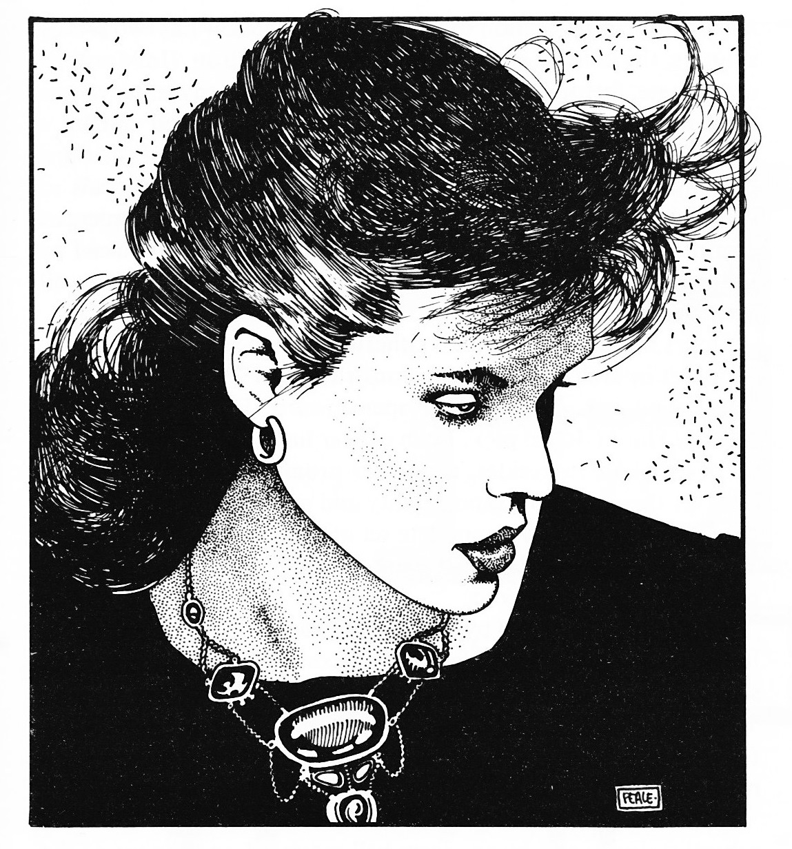
The final talent in this wonderful triumvirate is artist Charles Peale. His work is a flowing wonder that changes in style throughout the supplements he did art for, but still manages to draw the eye no matter what he sets his pen to.
Charles’s work is seminal in most of the early MERP supplements and there are several that simply take your breath away. When I decided to do this series, I set about to contact Charles and found that he’d actually worked for many years in a studio with Gail B. McIntoch, who is the primary focus of my first article in this series.
I was able to not only find Charles, but also get a few pressing questions answered about a handful of pieces I’d sent to him. What follows is his reply concerning a couple pieces you can find in this article.
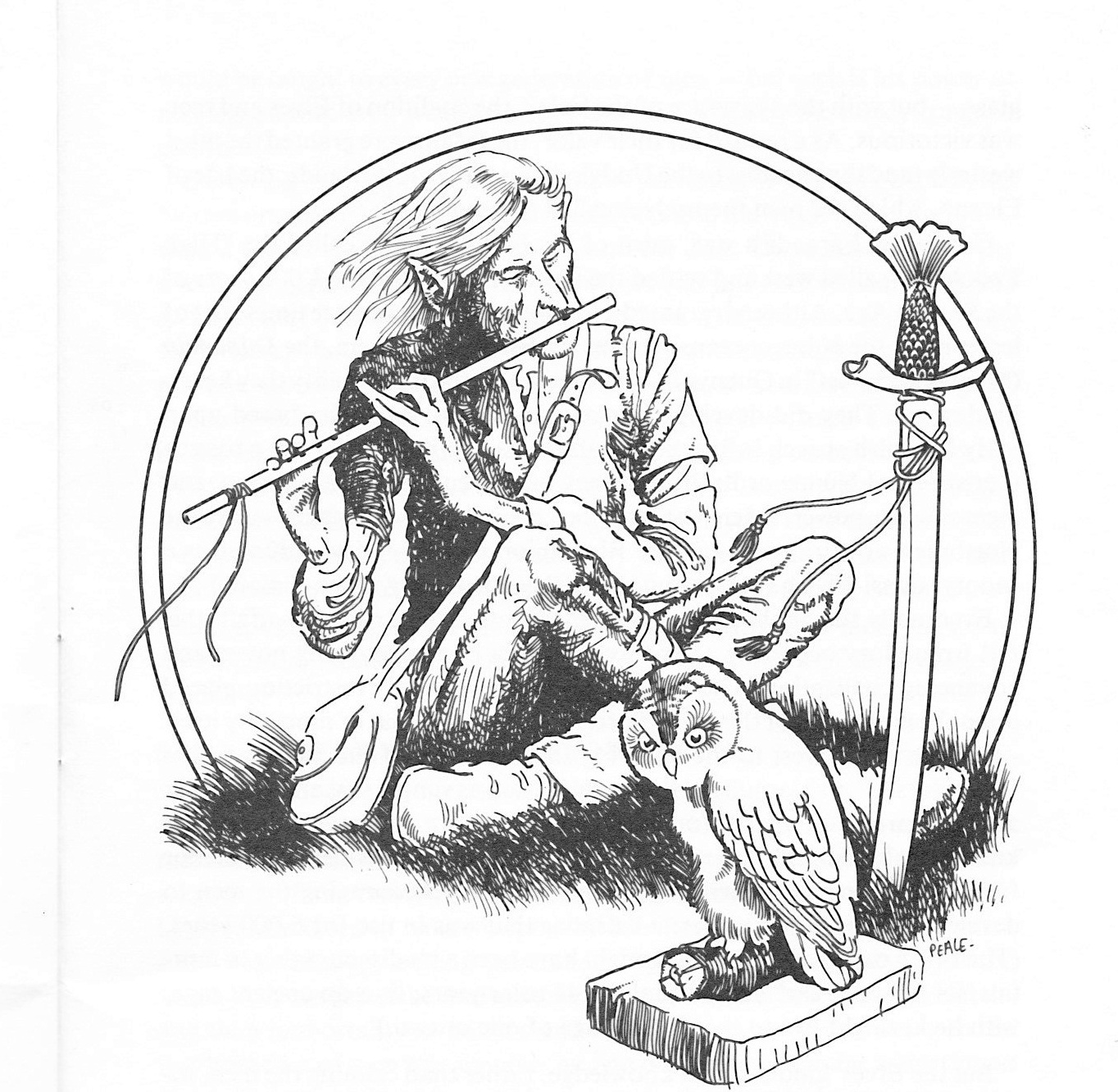
At the time that I was working on them, I didn’t know much at all about the role playing games. I was an admirer of comic books like Conan, Kull & Red Sonja. I was certainly influenced by the illustrations of Barry Winsor-Smith & Howard Chaykin. Jeff Jones & Frazetta. I do not remember where the idea for the Nazgul came from, I think that Rick or someone from Iron Crown must have suggested the character’s features & look. The dragon was drawn to be a similar sort of visual compliment to the old tree in the picture. I must have had some “dragon sources” but I don’t recall what they were. The Sorceress was somewhat different in style, as you noticed. There was an artist back in the seventies who drew sort of sexy women and his lithograph prints were everywhere! His name was Patrick Nagel and that was most likely my influence for that figure. Also, I used a stippling technique which I used quite often. I used to admire the stippling effects by a science fiction illustrator named Virgil Finley.
In the above, Charles runs the gamut of incredible artists that have helped define both his own techniques as well as fantasy, comic, and science fiction art for the past five decades, so you can well see why his work still resounds with emotion and wonder today.
With these three talents helping define the universe for players, there is no doubt why this game burst onto the 1980s gaming scene with such profound force, and again, proving rather definitively that, when taken as a collective whole, why Middle-Earth Role-Playing was indeed the prettiest RPG ever created.
You can check out Part One of this series here and Part Two here
If you like what you read in Art of the Genre, you can listen to me talk about publishing and my current venture with great artists of the fantasy field or even come say hello on Facebook here. And my current RPG Art Blog can be found here. Also, for my hardcore fans and those that love small press books, I’ve launched my latest crowd-sourcing campaign that I’m determined to see become the most successful fantasy fiction Kickstarter of all time, so come help me and all my artist and writer friends create a franchise to remember!
I’m inclined to agree. Much as I’ve enjoyed many of the movies based on books of my youth, this old artwork still conveys a sense of wonder no movie ever has. I still get thrills looking over it, whether it is of what the events around the image could be in my imagination, or even just remembering the times in my own life when I would stare at that art for hours.
I only had a few MERP supplements — Moria and I think something with Bree? — and sadly, they were lost to the ravages of time (i.e. the flood in 1992). I vaguely remember some of the earlier supplements used stills from the animated LotR movies as cover art?
(And speaking of ICE: Shadow World might warrant an art investigation at some future date …)
[…] If you’ve missed any of the previous posts concerning MERP, you can click the following for Part One, Part Two, and Part Three. […]